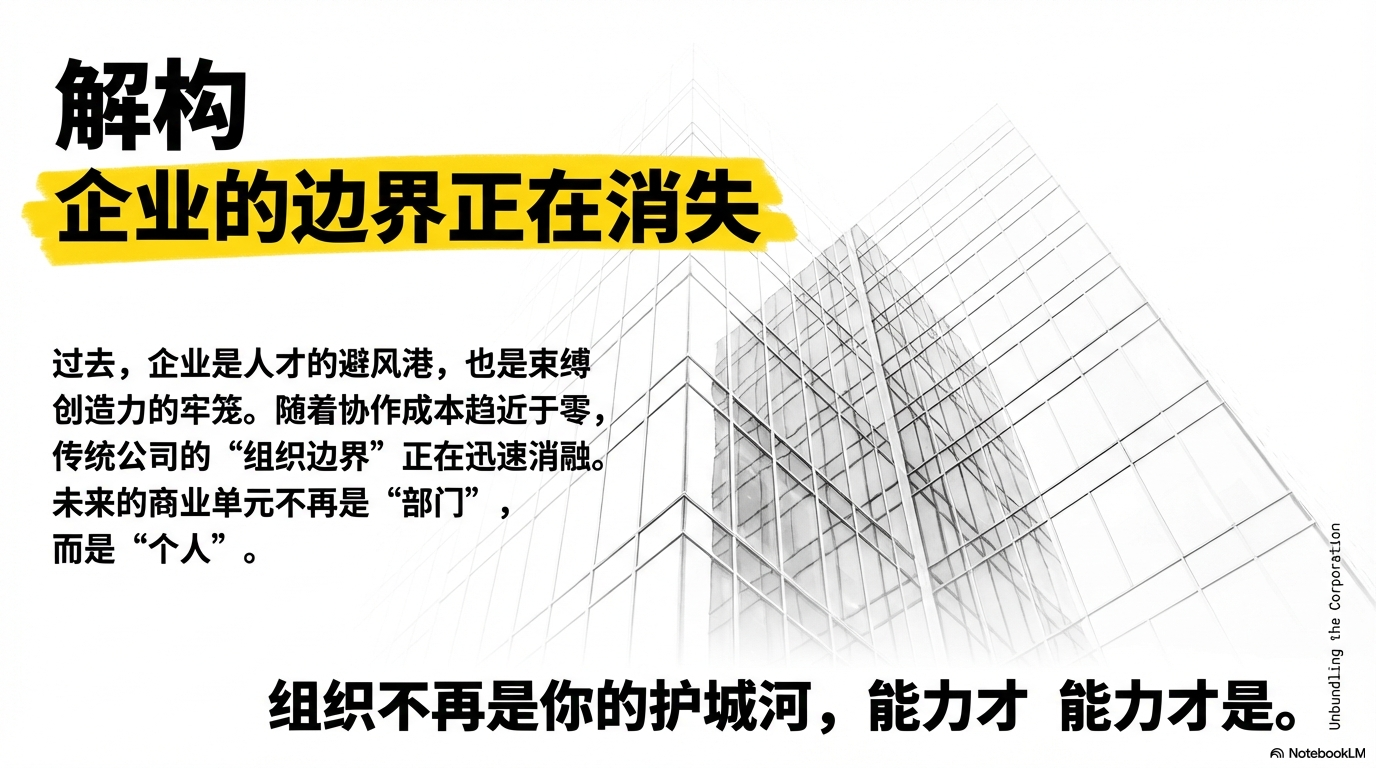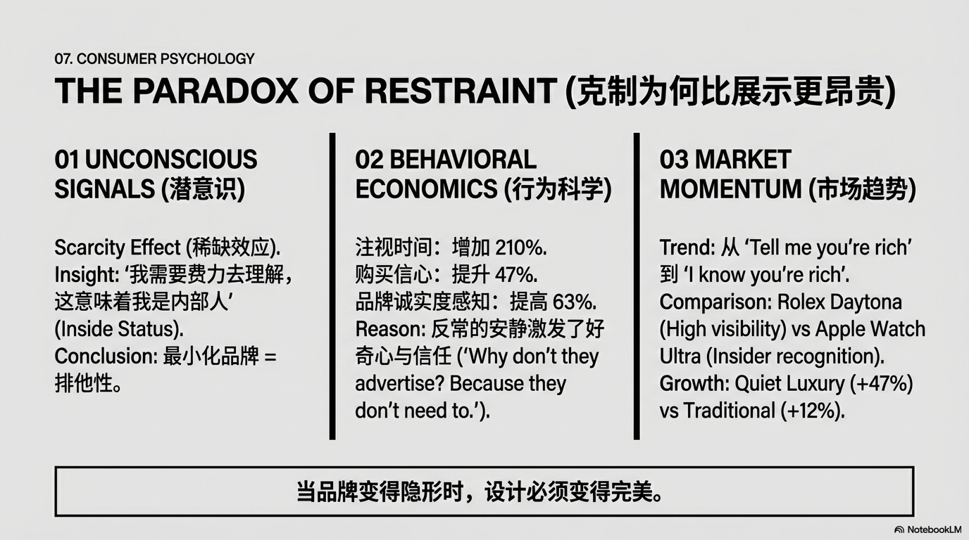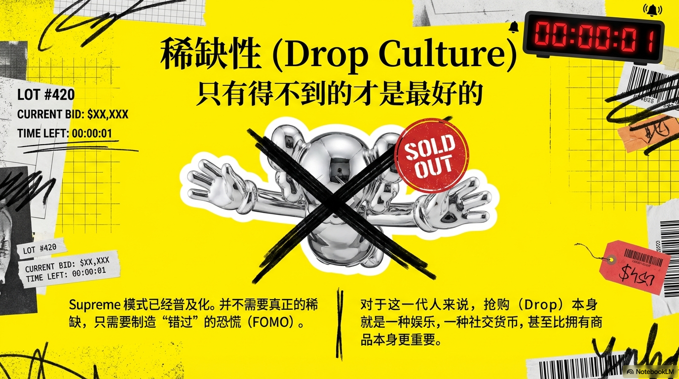
Style templates

Browse all preset PPT styles and full prompts. Use them in the style description when creating a project.

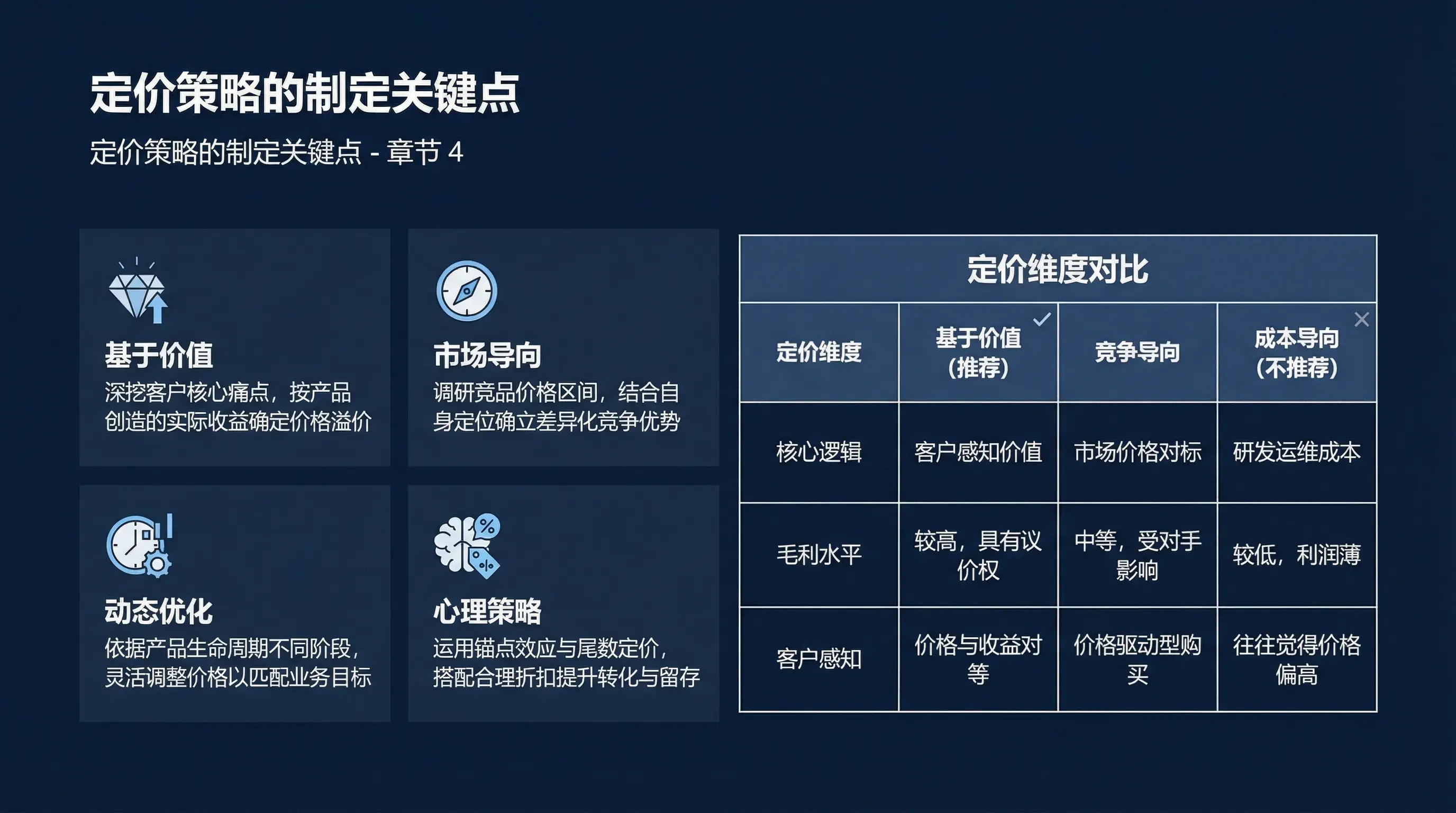
Business Simple

Visual Description: The global visual language strictly aligns with the universal business paradigm of top-tier international consulting firms, emphasizing professionalism, stability, restraint, and reusability. The entire presentation adopts extreme flat design and strong ordered grids, with clear information delivery as the sole priority. Prohibit gradients, glows, highlights, skeuomorphic textures, decorative background patterns, and any unnecessary visual elements. The lighting environment is fixed to uniform studio diffused light: no directional key light, no hard shadows, no dramatic light-dark contrast, maintaining a clean, bright, and calm overall appearance. Color & Material: The background color is locked throughout to Navy Blue (#0B1F3B). All heading and body text colors are fixed to pure white (White, #FFFFFF). The only accent color is fixed to Sky Blue (#38BDF8), used exclusively for key numbers, key conclusion keywords, key paths/connection line endpoints, and other primary emphasis, with its usage area not exceeding 3% of the total single-page area. Dividing lines, auxiliary annotations, and secondary boundaries use only Light Gray (#E5E7EB). Material expression is fixed to smooth vector color blocks; do not use paper textures, grain noise, metal/glass skeuomorphism, or any complex materials. The entire presentation defaults to no shadows; if shadows must be used for readability (limited to information cards separating from background), shadows must be extremely weak soft shadows without visible projection outlines. Content & Typography: Layout must follow a strict modular grid system, with all elements arranged according to unified alignment rules and baseline systems, using unified spacing scales for whitespace to ensure order and consistency. Page structure is fixed to geometric partitions: title area, main image/chart area, key points area, conclusion area; partition boundaries use 1px thin lines for division, with line color fixed to #E5E7EB (maintaining low contrast and restrained presentation on dark blue background), prohibit thick borders and decorative graphics. Fonts are fixed to sans-serif system: English fonts use Roboto, headings use Roboto Bold, body text uses Roboto Regular/Light; Chinese fonts use Source Han Sans, headings use Heavy/Bold, body text uses Regular/Light; the same hierarchy prohibits mixing different font families and weights. Mixed Chinese-English text must unify baseline and weight logic; emphasis is only allowed through font weight/font size and Sky Blue (#38BDF8). Illustration & Image Rules (Mandatory): To ensure flatness and consistency, all visual materials must adopt vector illustration form, unified as white line art (#FFFFFF), with key components or key paths only highlighted using Sky Blue (#38BDF8); prohibit direct use of color photographs, realistic rendering, complex backgrounds, and high-detail textures. Line thickness must be unified, corners regular, maintaining the simplicity and rationality of engineering drawings. Charts & Graphics: All charts must be 2D flat vectors, with unified line width, regular angles, no gradients, and no 3D effects. Default allowed chart types are limited to: bar charts, line charts, flow/architecture block diagrams; prohibit pie charts unless it is necessary to express proportional structure and categories do not exceed 5. Chart color scheme is fixed to white (#FFFFFF) as the main body, Sky Blue (#38BDF8) only for key data points/key path highlights, Light Gray (#E5E7EB) only for auxiliary scales and dividing lines. Minimize annotations, strictly align all text and values, simplify legends and decorative grids. Rendering Requirements: The entire presentation outputs as ultra-high-definition vector illustrations and business infographic style. All text and graphic edges must be sharp without aliasing, lines clean, hierarchy stable, contrast restrained, overall presenting rigorous enterprise-level business aesthetics, suitable for Fortune 500 formal presentation scenarios.
Use template

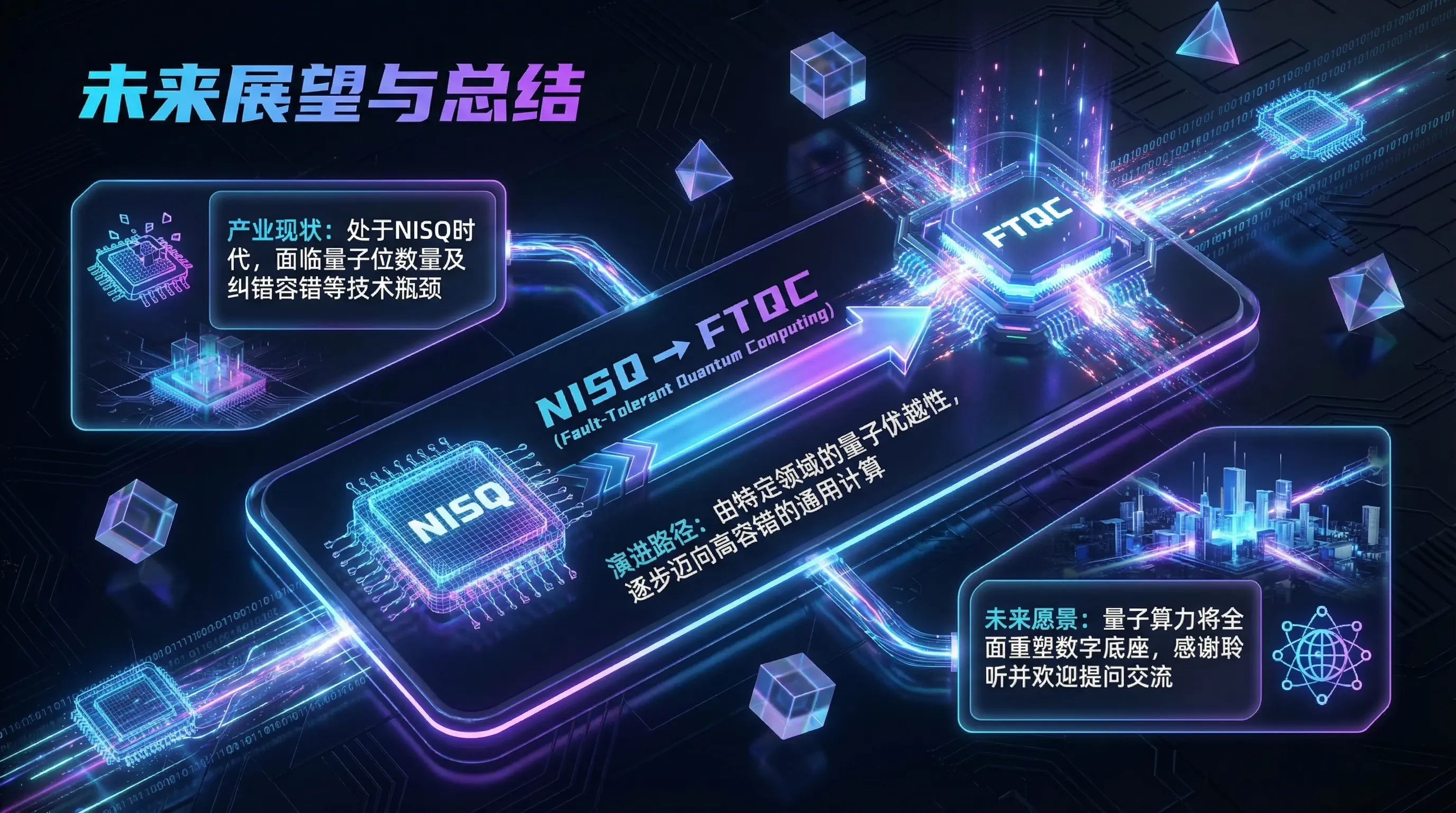
Tech Modern

Visual Description: The global visual language should blend cyberpunk with modern SaaS product futurism. The overall atmosphere is mysterious, deep, and dynamic, as if set inside a high-tech data center or virtual space. Lighting uses self-luminous effects in a dark environment, simulating neon tubes and laser glow. Color & Material: The background is a deep Midnight Black (#0B0F19) to contrast with foreground brightness. The primary palette uses high-saturation Electric Blue (#00A3FF) and Cyber Purple (#7C3AED) in linear gradients, creating a flowing energy feel. Materials heavily feature translucent glass, glowing grid lines, and metallic-sheen geometric shapes. Content & Typography: The scene should contain floating 3D geometric elements (cubes, tetrahedrons, or chip structures) with wireframe rendering effects. Layout favors asymmetric dynamic balance, using tech-feel monospace or modern sans-serif fonts. The background may subtly include circuit board textures, binary code streams, or dot-matrix maps as decorative detail. Rendering: Octane Render style, emphasizing ray tracing, bloom effects, and depth of field control, presenting refined particle effects and tech-driven visual impact.

Use template

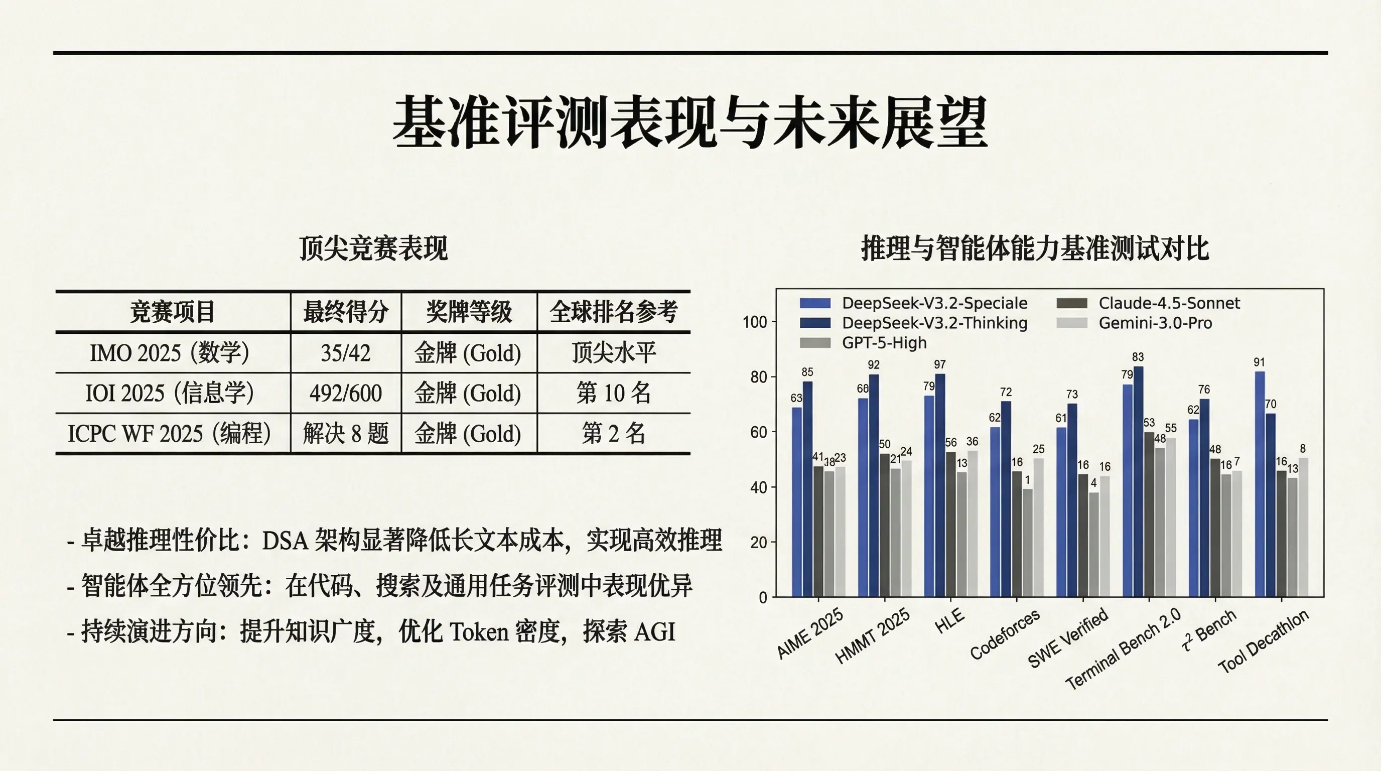
Academic Formal

Visual Description: The global visual language should emulate high-quality print publications or classic academic paper typesetting, conveying rationality, objectivity, and intellectual gravitas. The overall atmosphere is quiet and restrained, with no distracting glare or over-design. The image must fill the entire screen — no book bindings, paper edges, curled corners, shadows, or borders of any kind. The background should be presented in 2D flat style, not 3D. Color & Material: The background color is strictly Off-white (#F8F7F2), simulating premium book paper texture. Foreground colors use only pure black (#000000), Charcoal (#1F2937), and sparingly used Deep Red (#7F1D1D) or Deep Blue (#1E3A8A) as accent colors (no more than 5%). The material fully presents as high-quality printed paper with fine paper grain texture. Content & Typography: Typography must follow classic typographic design principles with generous margins. Use serif fonts (similar to Times New Roman or Garamond) to convey tradition and formality. Visual elements consist mainly of fine black line frames (#000000), standard academic table styles, and black-and-white line illustrations (#000000 / #FFFFFF). Layout uses left-right columns or top-bottom structured strict alignment. Rendering: Ultra-high resolution scan style, emphasizing font grayscale anti-aliasing and line sharpness, appearing like the inner pages of a hardcover academic journal, showcasing absolute professionalism and authority. No page borders, black frames, or shadow lines should exist.

Use template

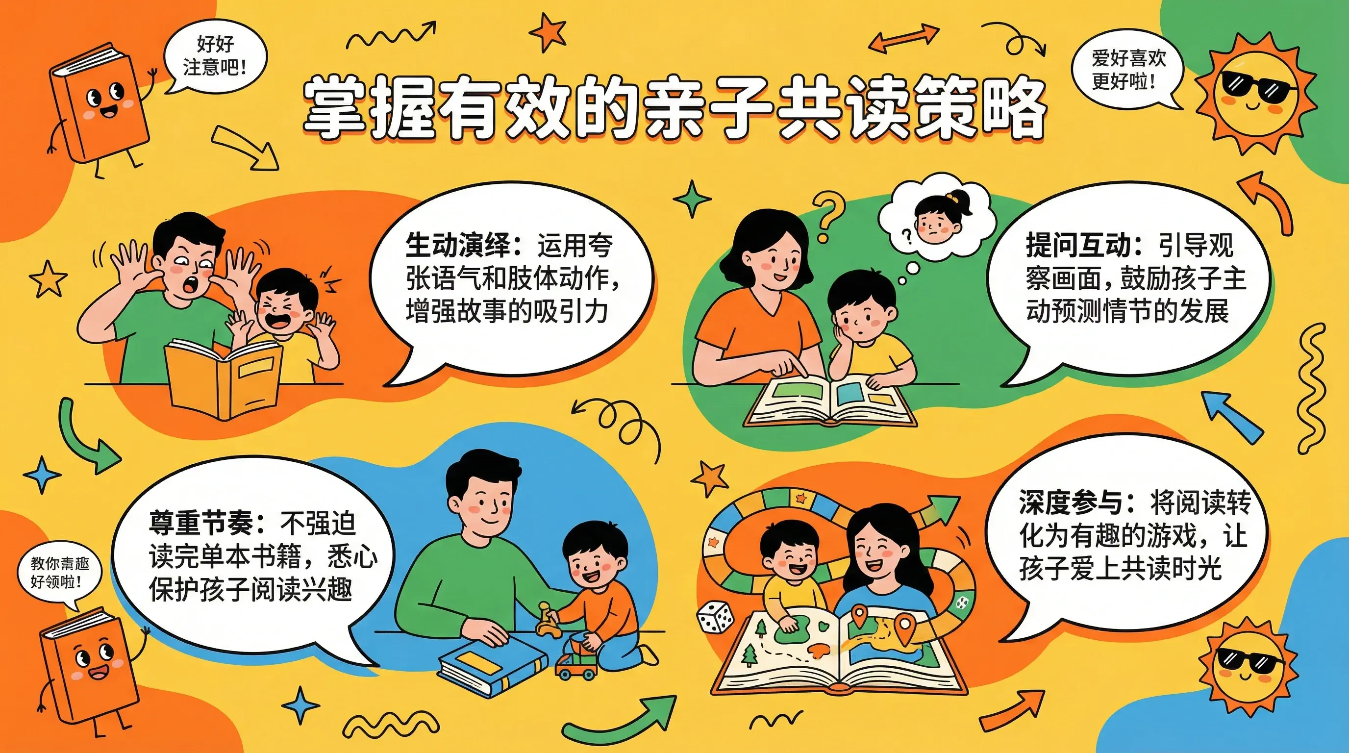
Creative Fun

Visual Description: The global visual language should resemble an energetic startup pitch deck or children's educational app interface. The overall atmosphere is relaxed, joyful, and imaginative, breaking conventional constraints. Lighting is bright and sunny, with no shadows between colors — completely flat design. Color & Material: The background uses a high-brightness Warm Yellow (#FFD54A). The color scheme is extremely bold, mixing vivid Vibrant Orange (#FF6A00), Grass Green (#22C55E), and Sky Blue (#38BDF8) to create Memphis-style color clashing effects. Materials simulate hand-drawn doodles, paper cutouts, or rough-edged vector illustrations. Content & Typography: The scene should contain hand-drawn illustration elements such as doodle arrows, stars, wavy lines, and irregular organic-shaped color blocks. Typography allows tilted, overlapping, or bouncing text, breaking rigid grids. Fonts should be rounded, cute bubble fonts or handwritten styles. Place some anthropomorphic cute objects or exaggerated speech bubbles in corners. Rendering: Dribbble trending illustration style, with vivid flat colors, smooth elastic lines, visually conveying a happy, friendly, and approachable feeling.

Use template

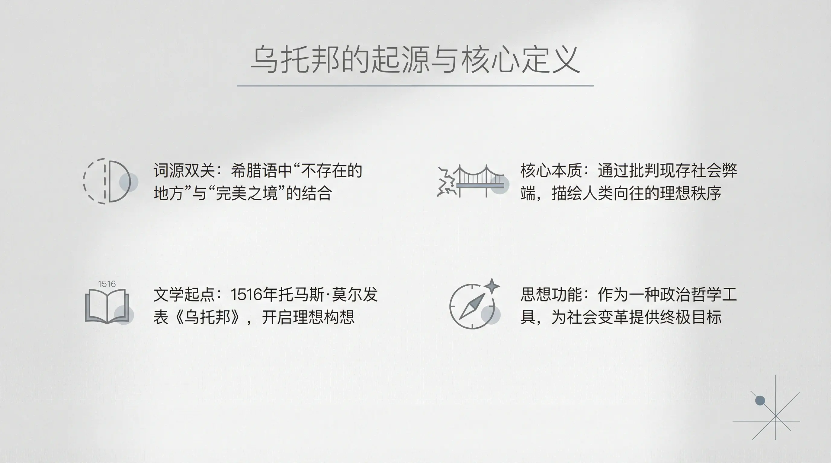
Minimalist Clean

Visual Description: The global visual language draws from Scandinavian Design and Kinfolk magazine aesthetics. The overall atmosphere is ethereal and tranquil, emphasizing the "less is more" philosophy. Lighting uses extremely soft diffused ambient light, with very faint and blurred shadows, creating an airy feel. Color & Material: The background is an ultra-light Haze Gray (#F5F5F7). Foreground colors use only Mid Gray (#6B7280) and low-saturation Morandi tones (such as Morandi Gray Blue #7A8FA6) as subtle accents. Materials feature fine matte finishes, with occasional slight plaster micro-texture. Content & Typography: The core of composition is negative space, which should occupy over 70% of the frame. Typography is extremely restrained — small font sizes, generous line spacing, using thin elegant sans-serif fonts. Visual anchors are simple geometric line icons, with layout pursuing absolute balance. Rendering: Minimalist photography style, high dynamic range (HDR), extremely clean images with no noise, presenting a gallery-like art display aesthetic.

Use template

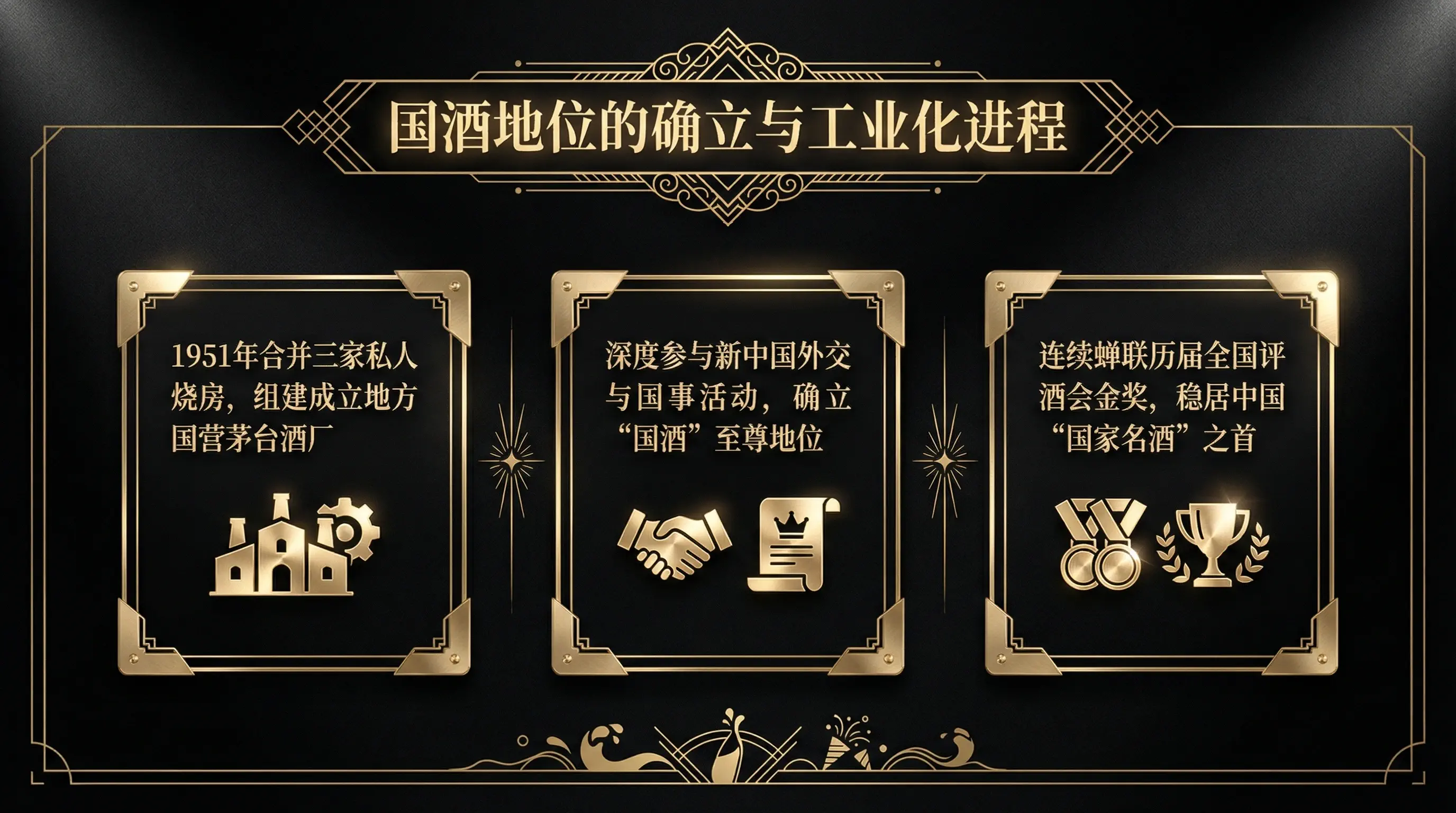
Luxury Premium

Visual Description: The global visual language should blend luxury watch advertising with five-star hotel brand imagery. The overall atmosphere is mysterious, noble, and unique. Lighting uses dramatic Rembrandt lighting or spotlight effects, illuminating key elements while the rest fades into darkness. Color & Material: The background is strictly locked to deep Obsidian Black (#0B0B0F). Foreground colors primarily consist of Champagne Gold (#F7E7CE). Materials must convey an expensive tactile quality — the core combination is: matte black velvet texture for backgrounds, brushed metal texture for foreground decorations. Content & Typography: Layout uses classic centered or symmetrical alignment, emphasizing ceremonial feel. Fonts must be elegant serif typefaces with slightly widened letter spacing to convey prestige. The scene may include delicate gold border lines and Art Deco decorative patterns. Any 3D objects should have a jewel-like polished quality. Rendering: Cinematic photorealistic rendering, emphasizing physical material properties (PBR), particularly metallic specular reflections and velvet diffuse reflection details, presenting luxury advertising campaign-level premium quality.

Use template

Nature Fresh

Visual Description: The global visual language aims to evoke longing for nature, environmental awareness, and healthy living, similar to Whole Foods or Aesop brand visuals. The overall atmosphere is healing, breathable, and organic. Lighting simulates morning sunlight filtering through leaves (Tyndall effect), warm and soft. Color & Material: The background uses a soft Beige (#EAD9C6). The color palette draws from nature, primarily using Forest Green (#14532D) and Earth Brown (#7A4E2D). Materials emphasize natural textures such as recycled paper grain and plant leaf veins. Content & Typography: The scene should integrate real natural elements, primarily extending green plant leaves, as background decoration or foreground framing. Typography uses rounded, approachable fonts. Layout can be slightly loose, mimicking natural growth patterns. Shadow treatment should be soft and natural, avoiding harsh black drop shadows. Rendering: Macro photography style combined with 3D rendering, emphasizing subsurface scattering on plant surfaces and fine natural material textures, creating a fresh and elegant image that feels refreshing and uplifting.

Use template

Gradient Vibrant

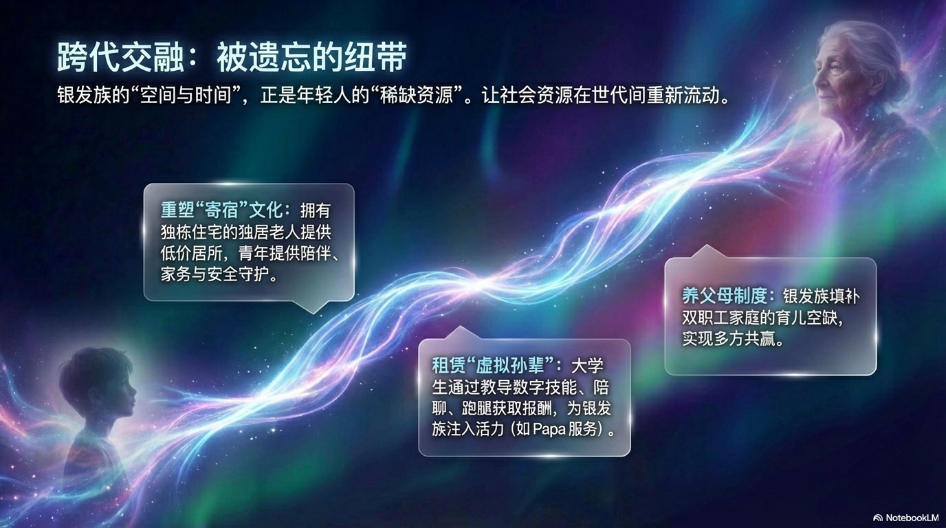
Visual Description: The global visual language benchmarks modern tech unicorn companies (such as Stripe or Linear) website visuals, presenting an aurora-like flowing beauty. The overall atmosphere is dreamy, translucent, and breathable, avoiding harsh color clashes and emphasizing elegant color fusion. Color & Material: The background IS the foreground, using full-screen diffused gradients. The palette uses elegant and harmonious "holographic colors," with a deep Royal Blue (#2563EB) base smoothly transitioning to Violet (#7C3AED) and bright Magenta (#DB2777). Colors blend like watercolors without hard boundaries. The material is locked to "frosted glass" texture, making colors appear as if glowing through a matte screen, adding an elegant haziness. Illustrations use textured semi-dimensional colorful designs. Content & Typography: The visual core consists of slowly flowing organic wave shapes with soft, natural forms. Typography uses bold sans-serif fonts, with text color in pure white (#FFFFFF) to ensure absolute clarity on the multicolored background. Interface elements use glassmorphism — highly transparent white rounded cards with subtle white borders and background blur effects. Rendering: C4D fluid simulation rendering, emphasizing "silk-like" smooth sheen, with subtle grain for texture. Colors are saturated but not glaring, showcasing an iridescent modern digital aesthetic.

Use template

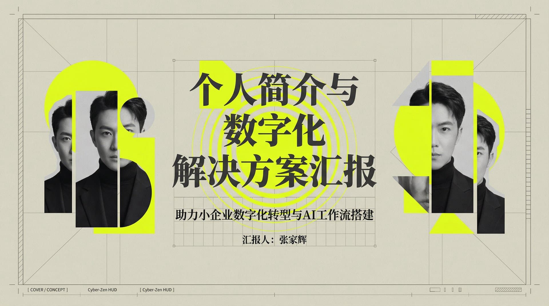
Constructivism Neon

# Style: Constructivism / Tech-Art / Avant-Garde # Concept: "Architecture of Intelligence" Global Design Settings: Tone: "Avant-garde, structural, intellectual, artistic, future-oriented" Visual Identity: Background Color: "Warm gray / beige (#E0E0D0) — matte, paper-like texture" Text Color: "Charcoal gray (#333333) — not pure black" Accent Color: "Neon Yellow (#DFFF00) — used for geometric shapes" Line Color: "Ultra-thin gray lines (0.5pt), similar to architectural draft lines" Typography: Headings: "Mix of serif (Didot, Bodoni) and sans serif (Helvetica)" Body: "Small-size text aligned strictly to the grid" Numbers: "Typewriter-style fonts (Courier New)" Slide Composition Patterns: # --- Cover / Concept --- Section: "Cover / Concept" Layout Type: "Triple Collage" Design Details: - "Structure: Screen divided into three sections with grid lines" - "Visuals: Monochrome cut-out portraits" - "Accents: Neon yellow circles and squares behind or in front of the subject" - "Decoration: Concentric rings (target-scope style) placed around the focal point" # --- Analysis / Diagram --- Section: "Analysis / Dissection" Layout Type: "Technical Drawing" Design Details: - "Background: Fine grid similar to graph paper" - "Main: Line-art / wireframe illustrations of products or concepts, partially filled in neon yellow" - "Annotations: Thin leader lines with blueprint-style labels (e.g., Fig.1, Fig.2)" # --- Process / Flow --- Section: "Process / Flow" Layout Type: "Geometric Connection" Design Details: - "Elements: Neon yellow circles, squares, triangles" - "Connections: Dotted or dashed lines linking shapes to express logic flow" - "Photography: Use shapes as masks to embed monochrome photos inside them" # --- Data / Infographic --- Section: "Data / Infographic" Layout Type: "Radar Chart Art" Design Details: - "Chart: Large spiderweb-style radar chart across the slide" - "Data Lines: Thick neon yellow plotting lines" - "Background: Subtle texture resembling old maps or blueprints" Design Rules: - "Color Limitation: Use only three main colors — beige (background), monochrome (photos), neon yellow (geometry)" - "Collage: Never place photos as plain rectangles; always cut out the subject cleanly" - "Layering Order: Grid background → neon geometric shapes → monochrome cut-out photo → foreground text"

Use template

Classical Pop

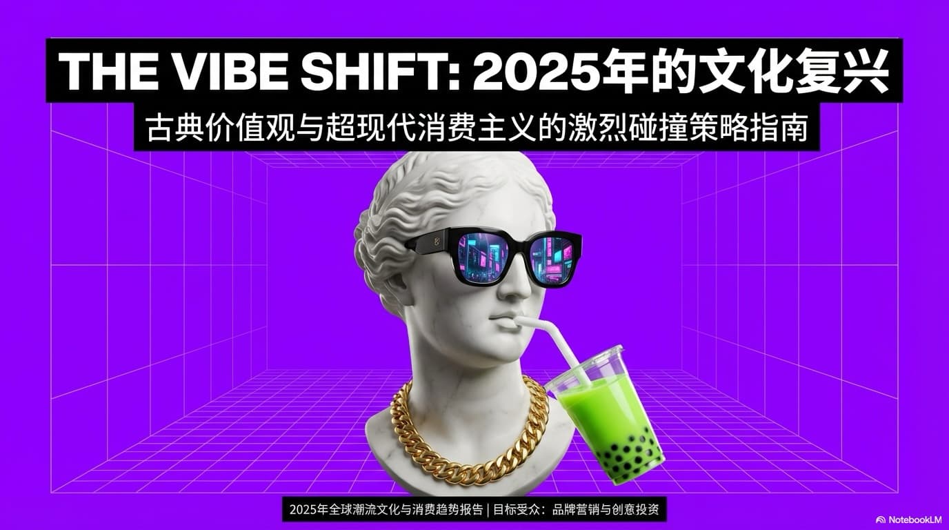
# Style: Sculpture Pop Art / Vaporwave / Neon Surrealism # Concept: "A Free Remix of Classical Art and Modern Pop Objects" Global Design Settings: Theme: "Classical marble sculpture × modern neon pop (flexible style)" Tone: "Bold, humorous, high-saturation, fashionable, surreal" Visual Identity: Background Colors: "High-saturation solid colors that change each slide (cyan, magenta, yellow, lime, purple, etc.)" Collage Materials: Sculptures: "Various classical white marble statues (men, women, gods, philosophers, etc. — change per slide)" Gadgets: "Modern pop items (sunglasses, headphones, smartphones, VR, food items)" Item Colors: "Adjust each object to be either complementary or analogous to the background color" Typography: Headings: "Ultra-bold sans serif (e.g., Helvetica Now Display Black)" Text Color: "Whichever color achieves the highest contrast with the background (white, black, or matching accent color)" Layout Variations (Catalog): # --- High Impact Visuals --- - Type: "Drink Vibes (Cover)" Design: "Vivid background. A classical bust wearing colorful sunglasses, sipping juice/soda with a straw in an extreme close-up." - Type: "Bubblegum Shock" Design: "A statue (goddess, child, etc.) blowing a large bubblegum bubble in a contrasting color. Scatter geometric shapes around the scene." - Type: "Music Head" Design: "Dark background (black or navy). A statue wearing bright-colored wireless headphones, immersed in music (or holding a smartphone)." - Type: "Scream Color" Design: "Bright background (yellow or lime). A statue with an expressive open-mouth pose wearing flashy-lens sunglasses." # --- Concept Messaging --- - Type: "Split Duality" Design: "Screen divided into two contrasting colors. A statue stands on the border, holding different modern objects in each hand (book vs tablet, pen vs smartphone)." - Type: "Selfie King" Design: "A statue lifting a smartphone for a selfie. Inside the phone screen, display SNS-style UI (likes, comments)." - Type: "VR Dive" Design: "A statue wearing VR goggles, looking upward into space. Floating 3D objects surround the scene." # --- Information-Focused Layouts --- - Type: "Donut Chart" Design: "Use real photos of donuts or pizza slices to build a donut chart. The statue is eating or holding the chart." - Type: "Item List" Design: "A statue holding pop items (sneakers, skateboard, boombox). Each item has a speech bubble explaining features." - Type: "Comparison (A vs B)" Design: "Two statues facing each other. One styled ‘Old’ with classical ornamentation, the other ‘New’ with modern accessories." - Type: "Team Pedestal" Design: "Multiple busts placed on pedestals as team members, each personalized with different sunglasses or hats." - Type: "QR Contact" Design: "A surreal ending slide: the statue has a QR code sticker on its forehead or is holding a QR code panel." Design Rules: - "Variation: Do not reuse the same statue across slides; alternate between male, female, and animal sculptures to keep visual novelty." - "Color Contrast: Ensure strong contrast between background and item colors (e.g., purple background × yellow accessories)." - "Isolation: Cleanly cut out statues and objects from their backgrounds, keeping edges sharp and precise."

Use template

Digital Neo Pop

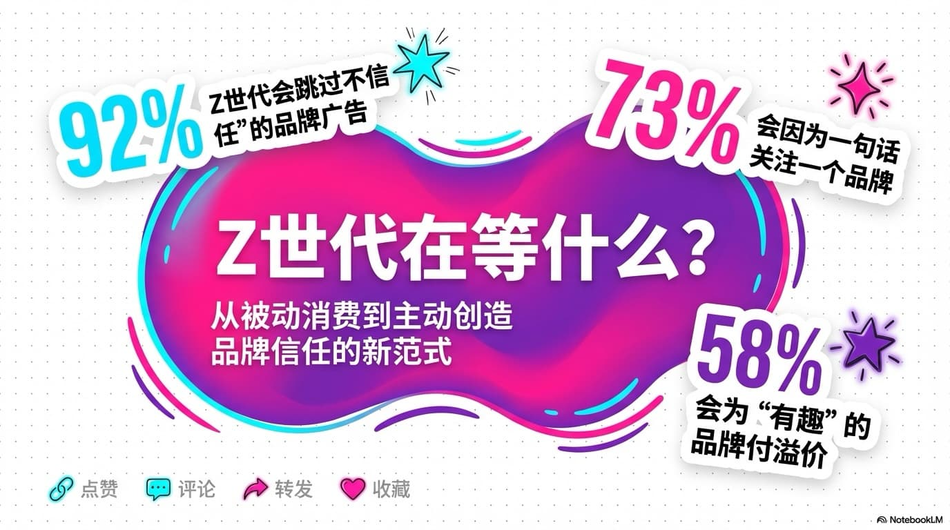
# Style: Vitamin Pop / Digital Neo # Characteristics: Organic shapes, bright color palette, SNS-friendly visual tone Global Design Settings: Design Theme: "Digital Pop × Academic" Tone & Manner: "Modern, fluid, friendly, high information density" Key Visuals: Motifs: "Organic amoeba-like or cloud-like shapes. Random placement around slide edges, partially cropped." Decorations: "Dot patterns, hand-drawn highlight strokes, SNS-style icon decorations" Color Palette: Base: "White (#FFFFFF) or light-gray dot-pattern background" Main Colors: "Vivid pink, cyan, purple (neon-sign inspired)" Accent: "Black (used for text and outlines to anchor the pop colors)" Chart Colors: "Gradient-filled bars (e.g., green → yellow)" Typography: Headings: "Bold gothic type. Impact-focused. Outline text (white fill + black stroke) allowed." Body: "Highly readable gothic sans serif." Numbers: "Large Western type for emphasis, especially percentages." Design Guidelines: - Organic Shapes: "Use irregular, hand-drawn, wavy shapes rather than strict rectangles or circles to express community fluidity." - Icons: "Prefer pop illustrations or abstract avatar icons (shapes with eyes, abstract faces) over photos of real people." - Information Contrast: "Balance text-heavy slides with highly visual slides." Layout Variations (Catalog): - Type: "Title Composition" Design: "Place an organic blob or cloud shape at the center and position the title inside it. Add small stars and sparkles around it." - Type: "Text + Data Pop" Design: "Split layout: left = text, right = colorful donut chart (vivid pink, cyan, purple). Emphasize numbers at extremely large scale." - Type: "Organic Timeline" Design: "A wavy vertical line like a plant stem. Use leaf/bud-like icons at timeline milestones." - Type: "Bubble Cluster" Design: "Overlapping translucent circles like soap bubbles. Use dot patterns in the background to enhance the pop feeling." - Type: "SNS Chat Style" Design: "A smartphone-style frame containing chat bubbles and icons. Important insights highlighted with bold text or marker strokes. Speakers represented by differently colored amoeba-shaped icons." - Type: "Concept Formula / Flow Diagram" Design: "Explain formulas like “Energy × Empathy” using hand-drawn arrows, icons, and crayon-like strokes." - Type: "Colorful Step Flow" Design: "Large arrow flowing left → right. Each step in a different color (cyan → purple → pink). Clearly marks progression." - Type: "Lollipop Chart" Design: "Use lollipop-style bars (round tips) or rounded bar charts. Color-code categories. Optionally overlay a line chart for combined visualization." - Type: "Sticker Grid" Design: "Slightly tilted square cards, appearing taped or stickered on the slide. Mimics a collage of sticky notes." - Type: "Character Ending" Design: "Place a cloud/amoeba character in the center. Arrange SNS icons (circular) around it to display contact information." Additional Notes: - Organic Shapes: "Use hand-drawn, wavy shapes—not rigid geometric forms—to convey community fluidity." - Icons: "Mix monochrome cut-out photos with bright pop illustrations and abstract avatar icons (eyes, blobs) to maintain friendliness." - Information Contrast: "Ensure clear rhythm between dense-text pages and visual-heavy pages."

Use template

Magazine Style

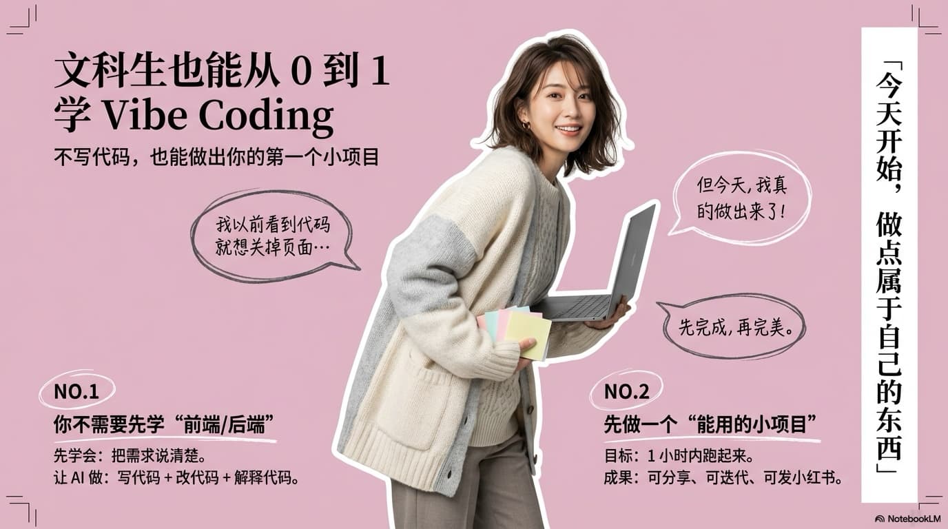
# Instructions Please compile [Source Information] in a [mature-cute, sophisticated magazine-style editorial design]. # Layout Requirements ・Place a large cutout photo of the subject (model woman or product) in the center, emphasizing movement or pose ・Place speech bubbles or text boxes asymmetrically in the left and right margins ・Distribute main points as small sections numbered like "NO.1" "NO.2" ・Place a vertical text box (white background) at the edge of the screen (e.g., right side) and insert a catchy copy ・Place L-shaped lines resembling crop marks ("trim marks") in the four corners to create a poster or page-like feel ・Format: Landscape (4:3 or 3:2), high resolution ・But the language should be what users said in the prompt. # Design Requirements ・Background color: Matte, subdued tone stylish pink (dusty pink or shell pink) ・Main image: Use a photo with the background completely removed (deep etching) ・Decorative elements: Use hand-drawn style speech bubbles, simple circles, and thin straight lines as accents ・Fonts: Headings in sophisticated Gothic or Mincho, comments in hand-drawn style font for a casual feel ・In speech bubbles or text boxes, write key points from the source information in emotional handwritten text of a young woman ・Color palette: Matte pink for background, charcoal gray or black for text, white for accents ・Overall atmosphere: Mature-cute, feminine, trendy, polished tone # Expressions to Avoid ・Overly childish vivid colors, overly flashy gradients, heavy shadows

Use template

Neo-Retro Dev Deck

Visual Description: The global visual language follows Neo-Retro Dev Deck / Pixel-Infographic Editorial — retro-futuristic, developer-centric, editorial infographic style, blending 90s computer manuals, modern AI dev-tool marketing, and pixel art meets startup slide decks. The mood is confident, playful, opinionated, slightly rebellious — *builders explain the future, not fluffy sales talk*. Canvas & Background: Use a light cream / off-white grid-paper background (around #FAF7F2 or #F5F0E6) with a subtle square engineering grid; grid lines must stay very light and never steal attention. Slides should read as annotated engineering notes, not corporate PPTs. Typography & Hierarchy: Primary headlines use bold, heavy, slightly condensed geometric sans-serif in black (#000000) for maximum contrast. Headlines may mix the user’s language with English; add small clean English sub-labels under primary titles. Structure: huge bold headline blocks → medium sub-titles → short captions under icons or cards. Color Palette (Strict): High-contrast color blocks with thick black outlines (#000000). Hot Pink (≈#FF1493) for agent / brain / intelligence; bright yellow (≈#FBBF24) for editor / code / tools; cyan / light blue (≈#22D3EE) for browser / web / execution; black for text and borders; white / cream for base. Each major section = one dominant color block. Layout Language: Stacked modular blocks — rectangles with thick black borders; slight overlaps allowed (intentional collage). Horizontal bars for section headers; card-based structure for steps, evolution, and layers. Slides should feel assembled, not perfectly aligned (controlled imperfection). Iconography & Graphics: Pixel-art icons (rocket, robot/agent, gear, code brackets, browser, chat bubble, etc.): low-res 8/16-bit look, flat colors + black outline. Decorative: small gears, arrows, chevrons <>, pixel sparks / motion lines. Content Patterns: A. “System architecture” — stacked layers with labels; each layer: one color, one icon, one bold title, one short line. B. “Evolution / timeline” — left→right progression in boxes; final step larger and more colorful. C. “Manifesto / thesis” — one huge headline in a frame, minimal text, surrounded by playful icons; reads like a statement, not a spec sheet. Tone of Text: Short, declarative, slightly opinionated; avoid marketing fluff (e.g. not “empowering users with cutting-edge solutions”). What to Avoid: No gradients, realistic photos, soft shadows, generic corporate templates, or minimalism for its own sake. This style is expressive, not quiet. Generation & Consistency: When generating multiple slides, keep the same grid background, color usage, icon style, and typography hierarchy end-to-end. The deck must look like one cohesive set, not individual posters.

Use template

Studio Mockup Premium

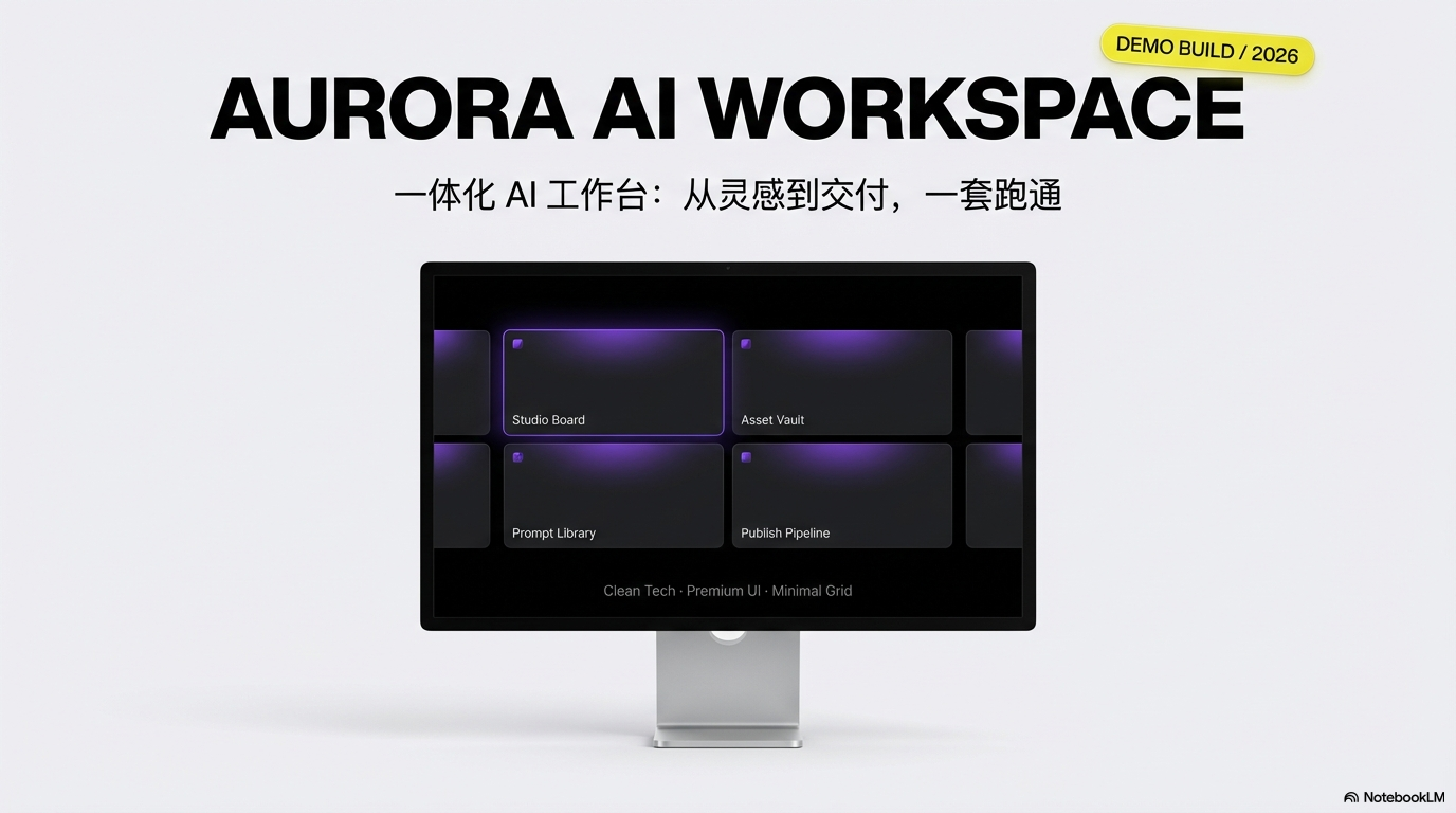
Visual Description: For app launches, website showcases, and digital product roadshows. Place UIs in high-quality 3D Apple device mockups (Studio Display, MacBook Pro, iPad, iPhone-class devices). The look should feel as polished and premium as an Apple keynote. Concept: “Showcase in Perfection.” Tone: high-end, advanced, clean, refined, professional. Color & UI: Slide backgrounds rotate among #FFFFFF, #F5F5F7 (studio light gray), and #000000 (jet black). Accents: Electric Purple #8D59E9 (primary action) and Acid Yellow #EBE021 (highlights, badges, key numbers). Support: #D8E2EC (cards, base areas) and #2D2D2D (UI text). On-screen UI may use jet black or vivid purple/yellow/orange gradients; use extra-bold white sans-serif; layout is card-based, grid, oversized numbers in a modern app style. Typography: Blocky sans-serif with a large size jump — large English, small text in the user’s language as subtitle. Body: thin gray sans-serif; for emphasis, set type on black, white, Electric Purple, or Acid Yellow fields. Set & light: Studio lighting with soft shadows under devices. Rules: “Screen is hero” — device glass should cover roughly 70–80% of the slide; crop/overflow is allowed for impact. Layout patterns (choose as needed): Hero Studio Display with dark UI; floating iPhone with blurred accent light behind; MacBook with a colorful UI card grid; dark mode with white + Acid Yellow; angled shot with specs in negative space; split half-device + big type with seamless color flow; extend device UI to full slide with white or purple cards on #D8E2EC; black canvas + huge white type + hairline rules; split “big number” vs. copy; white + rounded gray feature list with large English and small local subtitle. Design rules: High-resolution mockups (no visible pixels); realistic screen reflections and gloss; on-device UI stays spacious and minimal. Output reads as clean tech hardware advertising.

Use template

Editorial Lifestyle

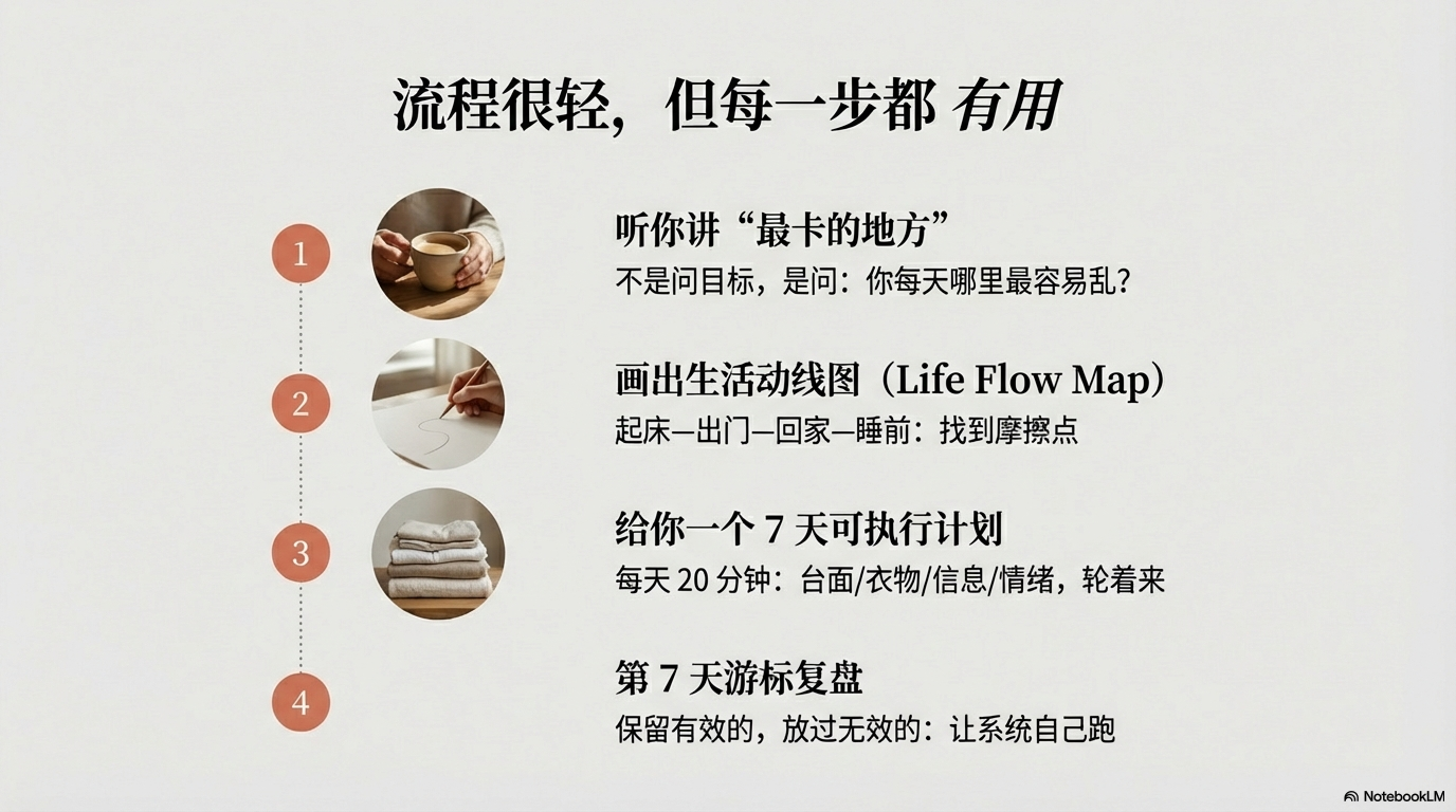
Visual Description: For lifestyle, interior design, craft, slow living, and interviews — like a Kinfolk-style magazine: calm, literary, premium; communicate through whitespace and atmosphere. Tone: calm, emotional, organic, intellectual. Color & imagery: Sand beige #F3F0EB or warm gray #EBEBEB; text charcoal #333333 (avoid jet black #000000). Accents: Terracotta #E07A5F or olive #708D81. Photography: natural light, film grain; image frames as arched window (semicircle top) or large rounded rectangle. Typography: Headings — elegant serif, key words in *italics*. Body — readable geometric sans-serif. Numbers — old-style or serif numerals. Section patterns: Cover — borderless photo on the right half, large multi-line serif title on the left, very thin rule between title and subtitle. Philosophy / quote — full sand background, short centered italic serif, light accent and giant quotation marks as a quiet backdrop. Service flow — vertical steps, (1,2,3) in small circles, very thin dotted connectors, small circular cutout photos per step. Data — ultra-thin line chart without heavy grid; earth tones (olive, brown, beige); add narrative paragraphs beside the chart, not just a legend. Design rules: No heavy borders — separate with whitespace; large Mincho-style (serif) headline + small Gothic (sans) body for a strong type scale; keep the palette warm — avoid cool bluish cast.

Use template

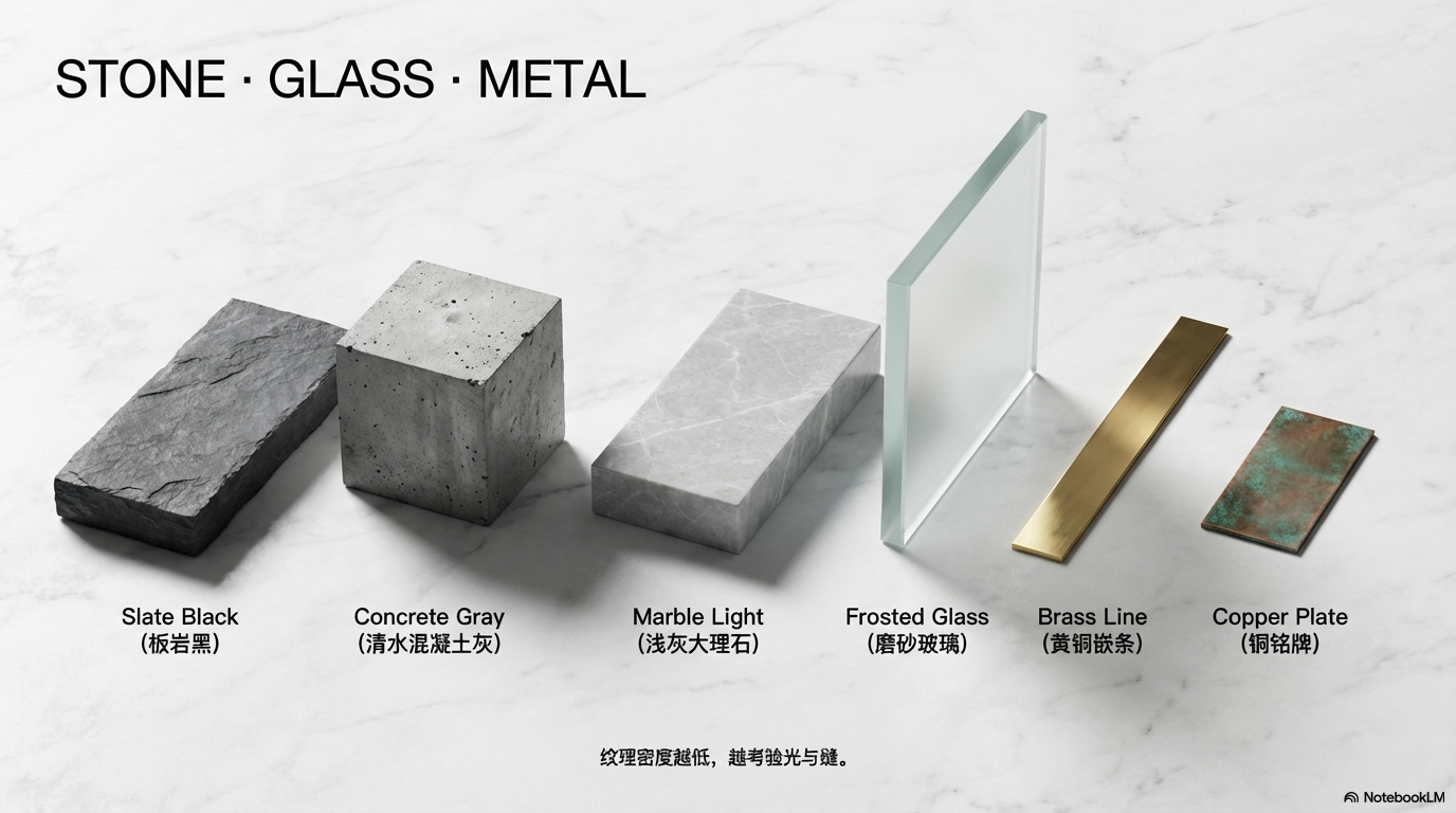
Stone & Glass Material

Visual Description: For architecture, real estate, luxury brand narrative, and “bedrock” logic — feels like exposed concrete / Tadao Ando-like permanence: serene, expensive, cool. Concept: Serenity and Materiality. Tone: tranquil, solid, futuristic, luxurious (quietly). Texture & light: Background reads as exposed concrete, marble, or slate; information hierarchy through frosted glass (glassmorphism) layers. Light & shadow: soft, realistic, as if natural light filters in. Palette: Base Cool Gray #E0E0E0 or Stone Black #1A1A1A; text matte black or matte white; accent metallic copper or brass (sparingly). Type & finish: Headings — thick sculptural sans-serif (e.g. Futura Bold feel), tight tracking; body — very small sans to stress vast space; consider debossed / engraved letter treatment. Layout patterns: Monolith title — huge central “stone slab” with the title carved in; Glass card — blurred photo back, frosted glass card forward; Architectural grid — hairline joints like concrete seams; Material graph — bars as 3D stone pillars or metal ingots; Lighting focus — one spotlighted focal point in a dim volume. Design rules: Assume light from upper-left; keep shadows and highlights consistent. Give elements thickness (e.g. darker side faces).

Use template

Urban Digital Twin

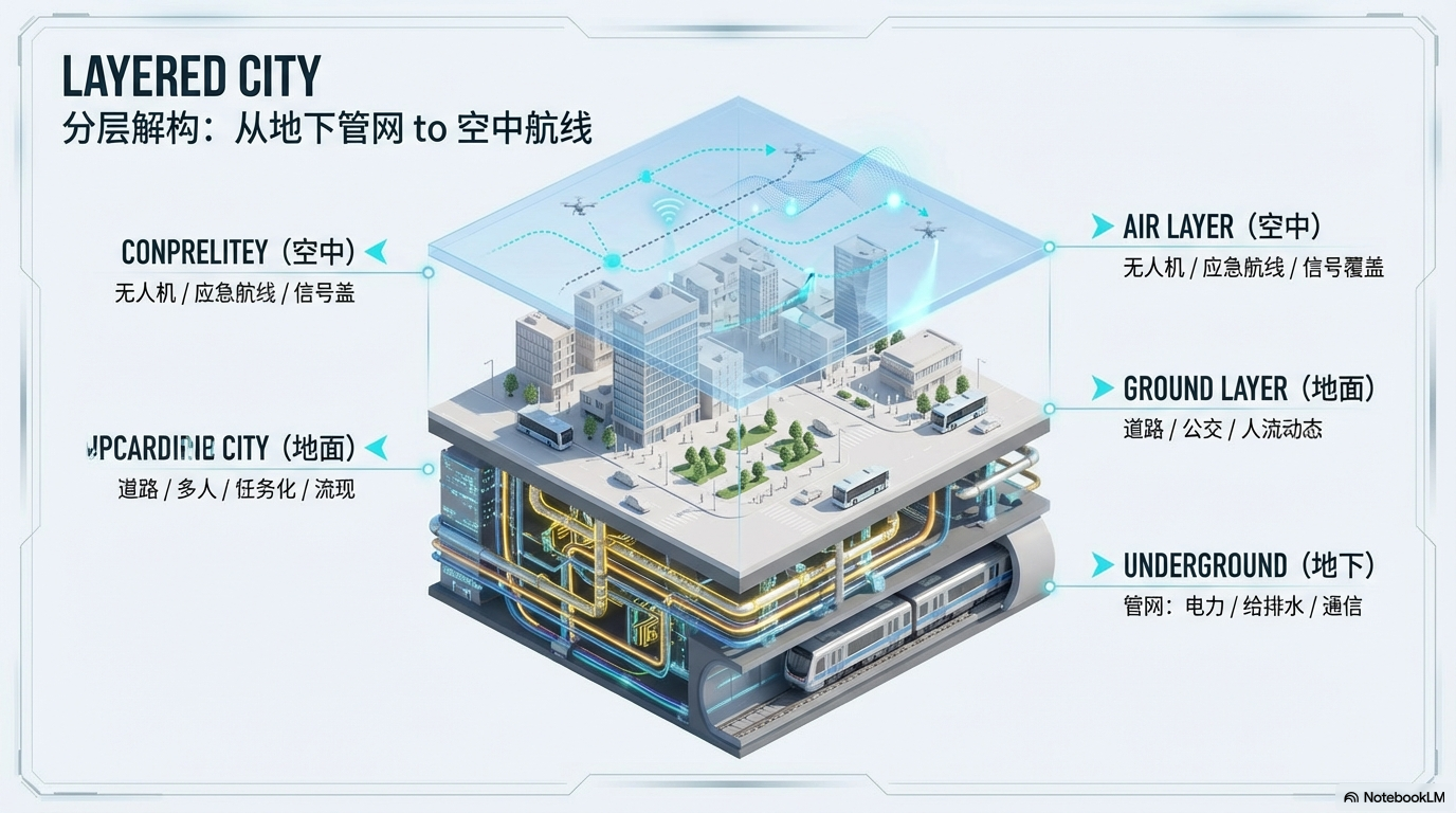
Visual Description: For city-scale systems — smart cities, logistics, traffic — a top-down, omniscient command view. Concept: an urban operating system in digital space. Tone: futuristic, detailed, structural, digital-twin, simulation. Perspective & materials: Perfect isometric projection, like a 3D CAD viewport. Ground: gridded digital floor; buildings pure white or translucent glass; mix matte white clay / maquette solids with wireframe layers. Color: Base Light Gray #F5F7FA or Dark Blue #0F172A (day / night); Neon Cyan #00E5FF for data, Amber #FFAB00 for warning. Color means function/status (normal / abnormal), not decoration. Type & density: Technical sans-serif (DIN-like), inorganic, system feel — large English titles, smaller user language; large Roman may use outline-only (hollow) strokes. Body: highly readable sans, small to raise information density. UI & labels: Corner overlays like 3D app chrome (axes, zoom, layer names); leader lines from roads/buildings to floating tags; thin floor grid for scale. Layout patterns: City overview isometric, colored zones, pop-up metrics; Layer / exploded underground / surface / air stacked; Building data — close-up, per-window heat for energy/vacancy; Traffic as light-particle flow, congestion pulsing red; Connectivity — parabolic comm arcs between towers; A/B split — current vs. future block; Construction — progress from wireframe skeleton to solid. Design rules: Realistic contact shadows (ambient occlusion) so buildings “sit” on the ground; subtle tilt-shift for miniature feel; no decorative color — semantic color only.

Use template

Sports & Energy

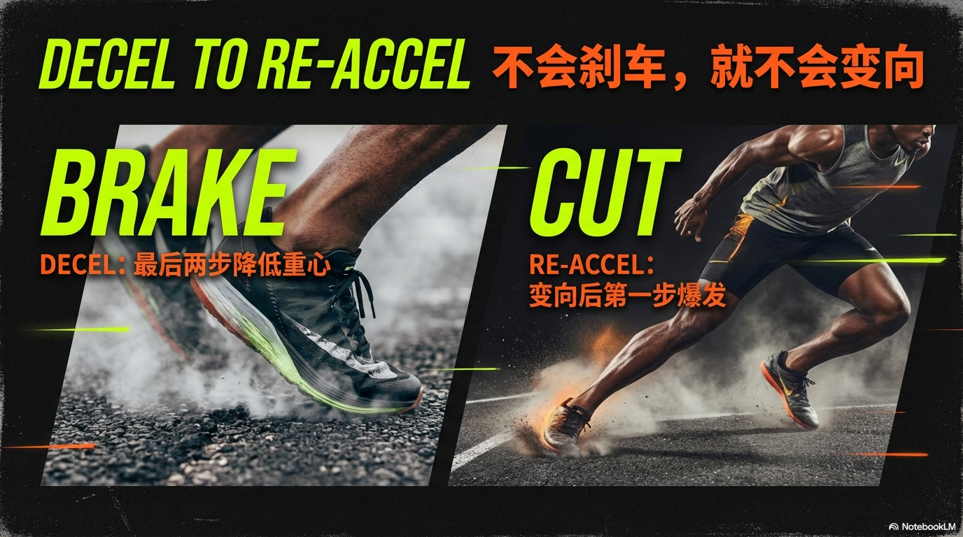
Visual Description: For rallies, head-to-head VS, fitness, esports — speed, pulse, and “we will win.” Concept: Speed and pulse. Tone: passionate, fast, powerful, competitive. Palette: Base asphalt black #111111; type white #FFFFFF; accent volt lime #CCFF00 or neon orange #FF4500; on photos, use a black-to-transparent gradient to darken the background and make foreground type pop. Type: Headlines — italic, extra-bold gothic/condensed (Impact / Din Condensed feel). Body — italic sans-serif. Numbers — sports / stencil / jersey typography. Global rules: Page numbers in diagonally cut shapes; use skewed rectangles, parallelograms, or tilted imagery. Layout patterns: Action cut — motion-blur photo + huge italic title with subjects overlapping type; VS layout — diagonal split: strengths bottom-left, competitor challenge top-right, jagged lightning divider; Speedometer — progress like a tachometer or scoreboard; Highlight stripes — diagonal marker strokes behind key words.

Use template

Modern Newspaper

Visual Description: For disruptive business takes and hot industry trends — a NewsPicks-style, smartphone-first “visual bomb” cover. Cover philosophy draws from Swiss Style / Bauhaus tension and grid discipline. On-slide text constraints (for the model): Do not output Markdown heading markers (#) or asterisk-based bold/italic syntax inside visible slide text; copy should be plain text in the user’s language plus English as specified. Cover (best effort): Avoid naive centered layouts. Use asymmetry and extreme placement — e.g. title pinned top-left or bottom-left on a grid, or a bold void of negative space. Title system: Main title (ultra-large, 2–5 character-style short phrase) as the visual hook; Subtitle (ultra-small, benefit/pain line). Punch the eyes with the main title, stab the mind with the subtitle. Core theme: Smart & pop business infotainment (curiosity × fun). Palette: #FFFFFF or cool gray #F5F5F5; text #111111; accent #FFCC00 or #FF3333; fluorescent highlighter yellow bars for key words and numbers for rhythm. Typography as graphic: Headlines can occupy 30%–50% of a slide. At least 10:1 size jump between headline and body. Extra-bold sans (≈Hiragino W8 / Impact class); tuck hairline English in gaps for air. Structure: One slide = one message; alternate dense type fields and huge empty space; end with a center punchline or type bleeding off the edge.

Use template

Sharp Minimal Portfolio

Visual Description: For design / architecture portfolios and high-end brand decks — expensive negative space and a ruler-strict grid, like a museum catalog. Tone: professional, architectural, sharp minimalism. Palette: #E9E9E9 or #FFFFFF; type #000000 or #333333; emphasis via black rules; optional black-background slides for emphasis. Type: Headings — English sans-serif (Helvetica Now / Inter class), bold, intentionally placed; body — small gothic/ sans in the user’s language with generous letter- and line-spacing. Global: Top-left (or right) nav on every slide — e.g. `01. INTRODUCTION`; strict grid; large intentional voids for luxury. Layout catalog (mix & match): Scattered stamp/badges + small center title; asymmetric split narrative left / giant number right + hairline rules; tight image card grid; full-bleed desaturated office or concrete still + tiny caption; 50/50 photo + list; silhouette map + hairline callouts; vertical timeline; Venn wireframe on black; minimal chat blocks; year + description list; dark constellation diagram; 01/02/03 typographic columns; monochrome logo grid; Problem | Solution with thick vertical divider; dark cinematic centered thumb + English tag; formula in large serif; arrows as containers; thin-line charts with dot terminals.

Use template

Yellow × Black Street

Visual Description: For street culture, fashion, and “check-in” content — loud, cool, and poster-like. Bright yellow full background + black type; large dynamic modern serif headlines; editorial fashion photography; scatter handwriting, stickers, collage; bold magazine-style layouts (not soft corporate).

Use template

Viral Minimal Business

Visual Description: For funding pitch decks and LinkedIn / social viral tiles — few words, huge statement; one hero image + a giant line in ~3s. Work from provided sources only (no invented fluff). Principles: (1) Visuals first — every slide has a strong key visual; (2) one main idea per slide; (3) minimal text — big headline under ~8 words, supporting lines under ~15 words each; (4) theme — white background, black text, exactly ONE accent color across the deck.

Use template

High-Impact Infographic

Visual Description: For personal IP and deep how-to — turn complex know-how into a start-to-finish, visual story people save and share. Slide count follows source complexity. Visuals: Turn each key concept into a strong visual metaphor from the source; turn stats into clean elegant charts (donut/ring %, icon charts, progress bars); use a cohesive palette that matches the topic’s emotional tone; every slide must use one proven viral layout: Hero (dominant headline + one visual), Contrast (before/after or split comparison), Icon grid (points as icons, minimal text), Quote focus (statement + context visual), Process flow (clear steps/flowchart). Narrative spine (trim as needed): (1) Compelling start — most surprising insight as a bold visual line; (2) Context / problem; (3) Central concept as diagram or metaphor; (4) Key components as icon grid or visual list; (5) Application / case; (6) Actionable steps; (7) Impact & results; (8) Memorable close + next step.

Use template

Modern Flat Storytelling

Visual Description: For strong takes and hard methodologies on LinkedIn / social feeds — one slide one idea, ultra flat, no ornament; actionable, save-worthy. Use ONLY provided sources — do not invent tools, examples, or workflows not present in the sources. Visuals: Every key idea → strong visual metaphor; all stats → clean data viz (ring %, icon charts, progress bars); one cohesive emotional palette. Each slide must use one of these layouts (extended layout set): Hero, Contrast, Icon grid, Quote focus, Process / flow, Timeline / storyline, Before/After, Full-bleed photo + type, Data spotlight (single number magnified), Audience question / challenge prompt, Anatomy breakdown (labeled parts), Comparison matrix, Testimonial with face/avatar, Minimalist one-word/phrase art type, and related viral layout patterns. Narrative: same 8-beat arc (hook → context → core → components → application → steps → impact → close). Typography: Headline ≤8 words; each bullet ≤15 words; hierarchy title > point > evidence; use size, weight, and color contrast. Theme (stricter than Case 15): Background off-white / white; primary type near black; secondary neutral gray; exactly one strong accent — pick one family: strong blue OR strong orange (not both mixed per deck logic); max one accent color per slide; accent only on the main idea/number; keep all other visuals neutral with a single highlight; no gradients, no drop shadows, no rounded “cards.” Safety: Cite only concepts explicitly in the sources.

Use template

Wagashi Warm Hand-Drawn

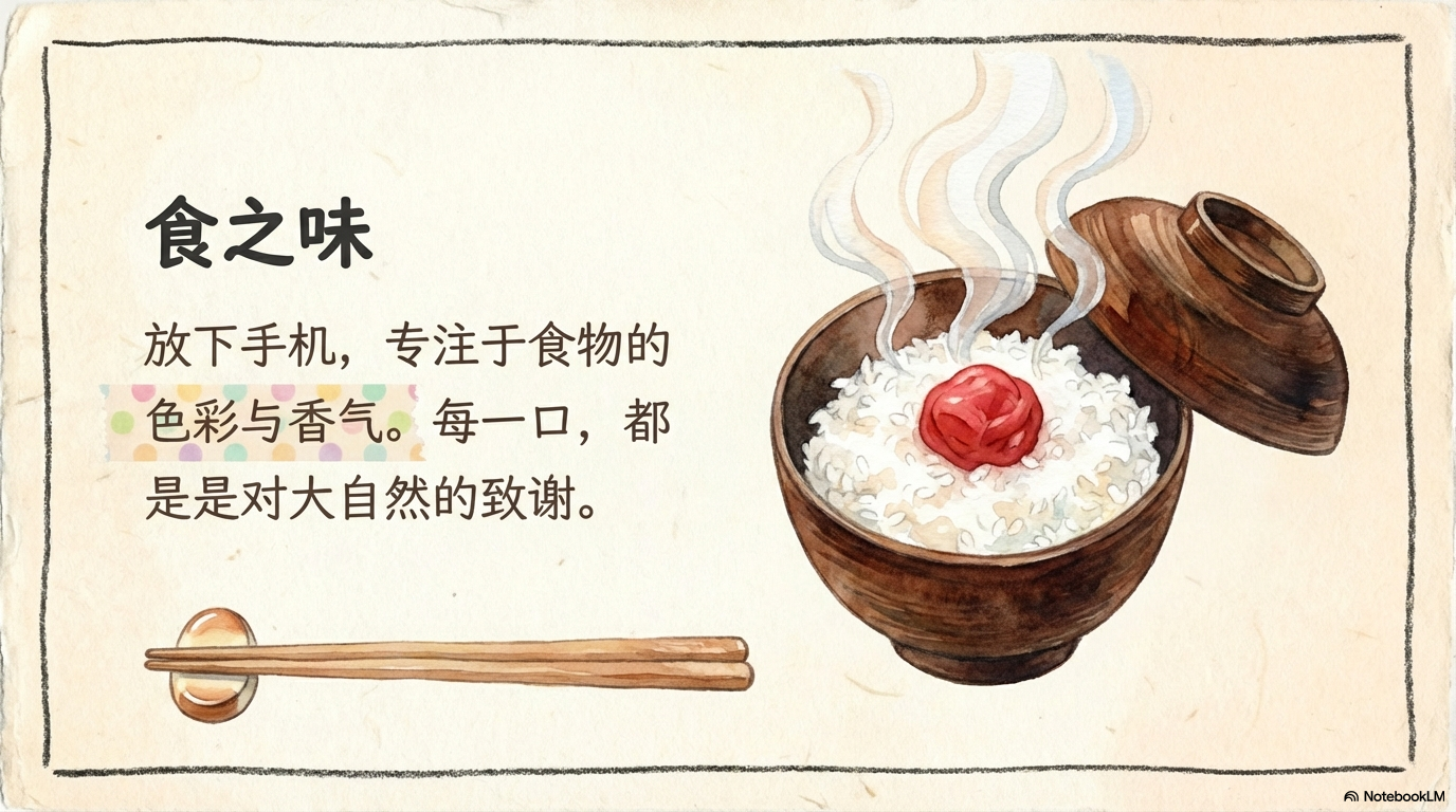
Visual Description: For cozy lifestyle — recipes, parenting, craft, emotional healing. Feels like fresh bread and slow living — warm, relaxed. Background: #FDFCF0 meeting #FFEBD7, with a whisper of washi / bleached wood-pulp paper texture — soft, not glaring. Motifs: Borders as wobbly pencil lines, not perfect vectors; corner watercolor vignettes (matcha leaves, warm orange, steam lines); keyword strips on torn washi tape underlines. Type: Round handwritten or song-style serif; loose line height like a journal.

Use template

Nordic Collage · Hygge

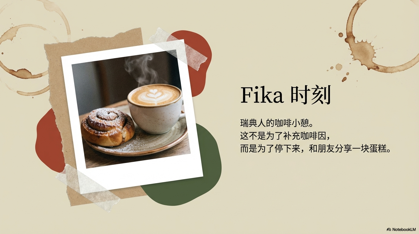
Visual Description: For café OOTD, forest/minimal style, home goods, vlog-style covers — effortless chic; flipping a Kinfolk / Cereal-grade editorial. Background: Low-saturation dusty blue or oatmeal (≈#E0DCC8 / #B0C4DE family) — matte paper look. Collage: Cutout people/products on torn kraft; organic blob shapes in brick red and deep moss green; photos in Polaroid frames with light film grain. Type: Elegant serif paired with ultra-thin sans-serif for secondary lines.

Use template

Dark Academia Library

Visual Description: For literary deep dives, mystery narratives, centennial brand heritage, humanities/science with gravitas — a Hogwarts-library mood: mysterious, learned, time-tested. Background: Dark Mahogany #420D09 or Midnight Green #003322 with worn leather grain and a vignette to deepen edges. Graphics: Copper-plate etching illustrations (anatomy, botanical plates, antique star charts); double gold hairlines, Roman column frames, fleur-de-lis corners; photos as sepia, scratched, grainy “old print.” Type: Old-style serif, all-caps headers, engraved gravitas. Tone: scholarly, arcane, classic.

Use template

Black & Gold Empire

Visual Description: For ultra-luxury goods, private banking, members-only clubs, invitation-only offers — “members only” authority; like an Amex Centurion invite. Background: Matte black or deep charcoal with a subtle rock/mineral grain so black stays alive. Look: Titles in champagne-gold foil gradient (not gaudy “bling gold”); hairline rules for all divisions; generous “black void” negative space; high-end B&W photography with only the product in color or a gold spotlight wash. Mood: Breathtaking, expensive, pro-level authority.

Use template

Glassmorphism · Deep Tech

Visual Description: For SaaS, dashboards, blockchain, metaverse — deep space background + glass cards, like macOS or premium fintech UIs. Background: Navy → deep purple gradient — abyss or night-sky depth. Elements: Frosted-glass cards — semi-opaque white panels, background blur, fine white edge glow, type floating on glass; add soft glowing blurred 3D orbs/liquids; charts in saturated electric blue or neon cyan for max pop on dark. Mood: Modern, airy, high-tech.

Use template

Concrete · Industrial

Visual Description: For logistics, construction, infra architecture, Off-White-style street analysis — concrete grey + safety orange; raw, honest, structurally sound; no empty flex. Background: Layered cool concrete greys with cast concrete / wall texture. Elements: Faint engineering grid; ultra-bold sans (stencil, shipping-stencil feel); one accent only — safety orange or fluorescent yellow for arrows and callouts. Mood: Tough, systematic, trustworthy.

Use template

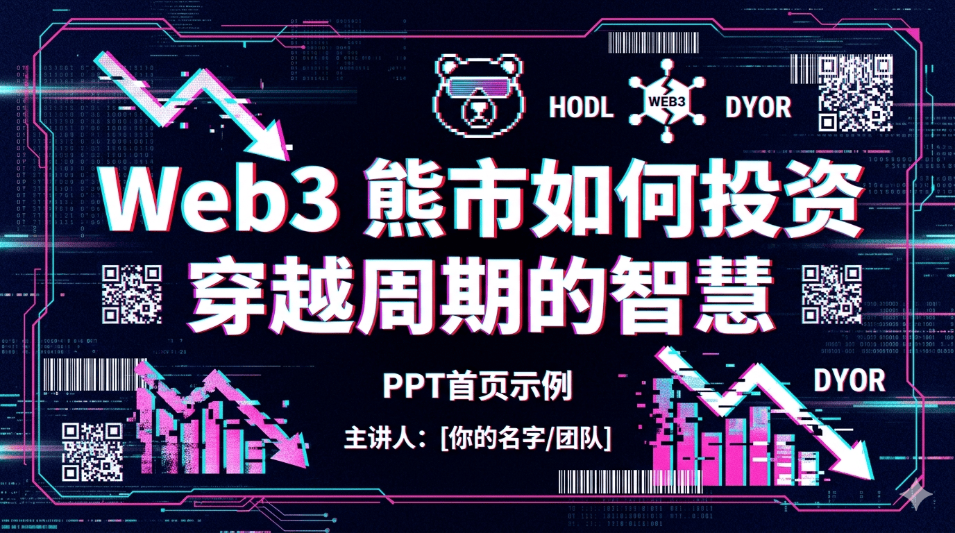
Cyberpunk Glitch

Visual Description: For Web3, metaverse, hackers, crypto, Gen-Z subcultures — signal about to break; I make the new rules energy. Background: Near-black midnight blue with digital noise grain. Elements: Glitch type — offset layers, RGB split; hot pink × cyan contrast; QR, barcodes, pixel icons as chrome. Mood: Rebellious, futuristic, rule-breaking.

Use template

Liquid Gradient · Aurora

Visual Description: For brand vision, healing, flow/inspiration/connection — borderless flowing gradients; dreamlike, intangible; both romantic and high-dimensional future. Background: Deep violet base, not flat; slow mesh/aurora gradients — blue, purple, coral bleeding like paint in water. Type: Pure white, wide tracking, airy; soft image edges that dissolve into the field. Mood: Dreamy, emotional, fluid.

Use template

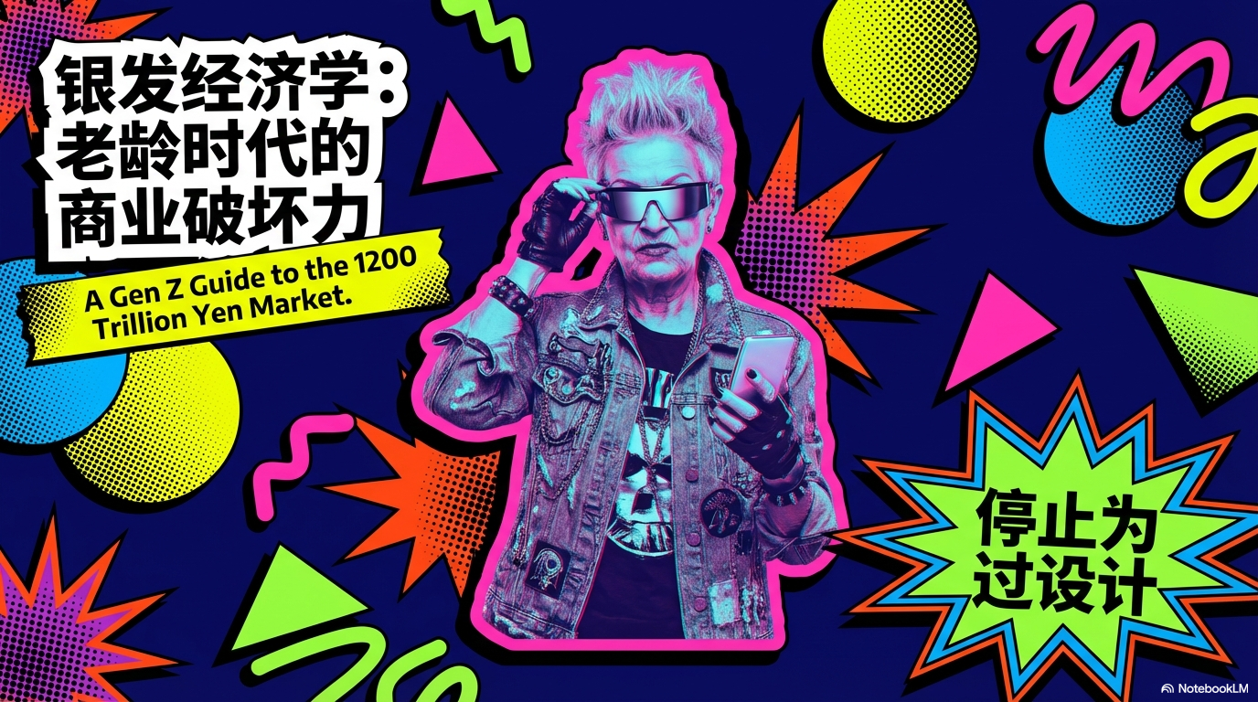
Dark Memphis

Visual Description: For club promos, music fests, markets, playful year-end — ordered chaos stickers and loud clashing color; we’re here to have fun. Background: Dark ultramarine or deep purple — not white. Elements: Waves, dots, triangles in bulk with bold black outlines; hard drop shadows like stickers; cutout photos with heavy color grades. Mood: Hyper, young, slightly messy energy.

Use template

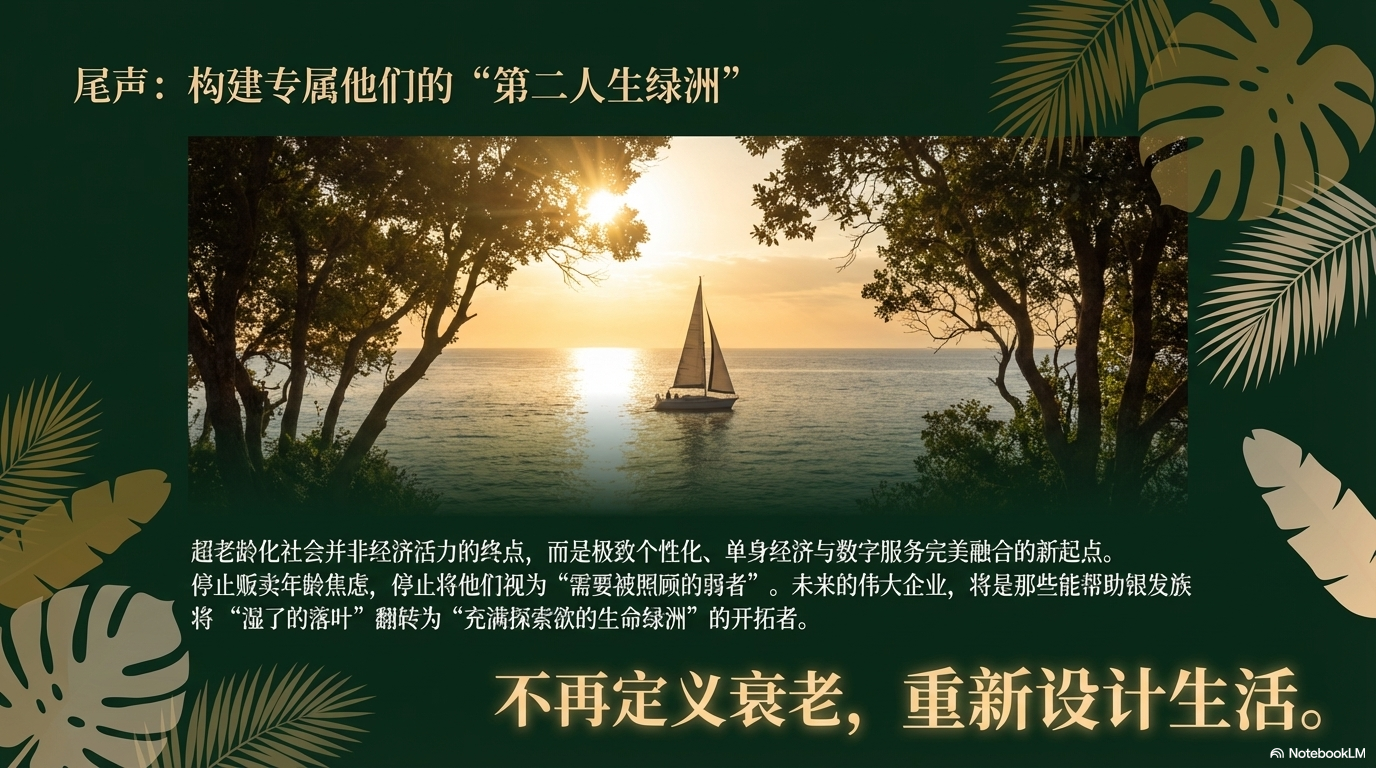
Tropical Night · Forest

Visual Description: For resort, rainforest, spa, premium coffee or skincare, organic brands — deep green + warm cream-gold type: mysterious, private, more upscale than default “beach sun.” Background: Very deep forest green. Elements: Giant leaf silhouettes (monstera, palm) peeking from edges; type in lazy resort cream/gold; high-contrast outdoor photography like backlit road signage on green. Mood: Organic, alive, relaxed, luxe.

Use template

Premium Blue & Gold

Visual Description: For annual strategy, Series C, enterprise B2B, multinational reporting — weight + forward vision for big screens. Synthesize: Deep blue + metallic gold gradient; subtle geometric/arrow texture for depth; frosted-glass overlay; strong negative space on one side; cinematic soft light and specular; 8K-sharp, minimal, few elements, 16:9, perfect type–image alignment, each slide clean and uncluttered.

Use template

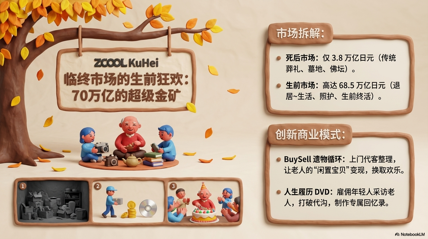
Clay Stop-Motion

Visual Description: For kids’ products, creative marketing, team icebreakers, fun science — soft clay + vivid color, Shaun the Sheep-level warm and playful. Look: Full deck reads as clay stop-motion — bright clays (red, blue, green), posed characters/props (jump, spin, squash); soft clay background; titles as hand-pressed clay letterforms; optional small comic beats per slide; cute, interactive, high-res.

Use template

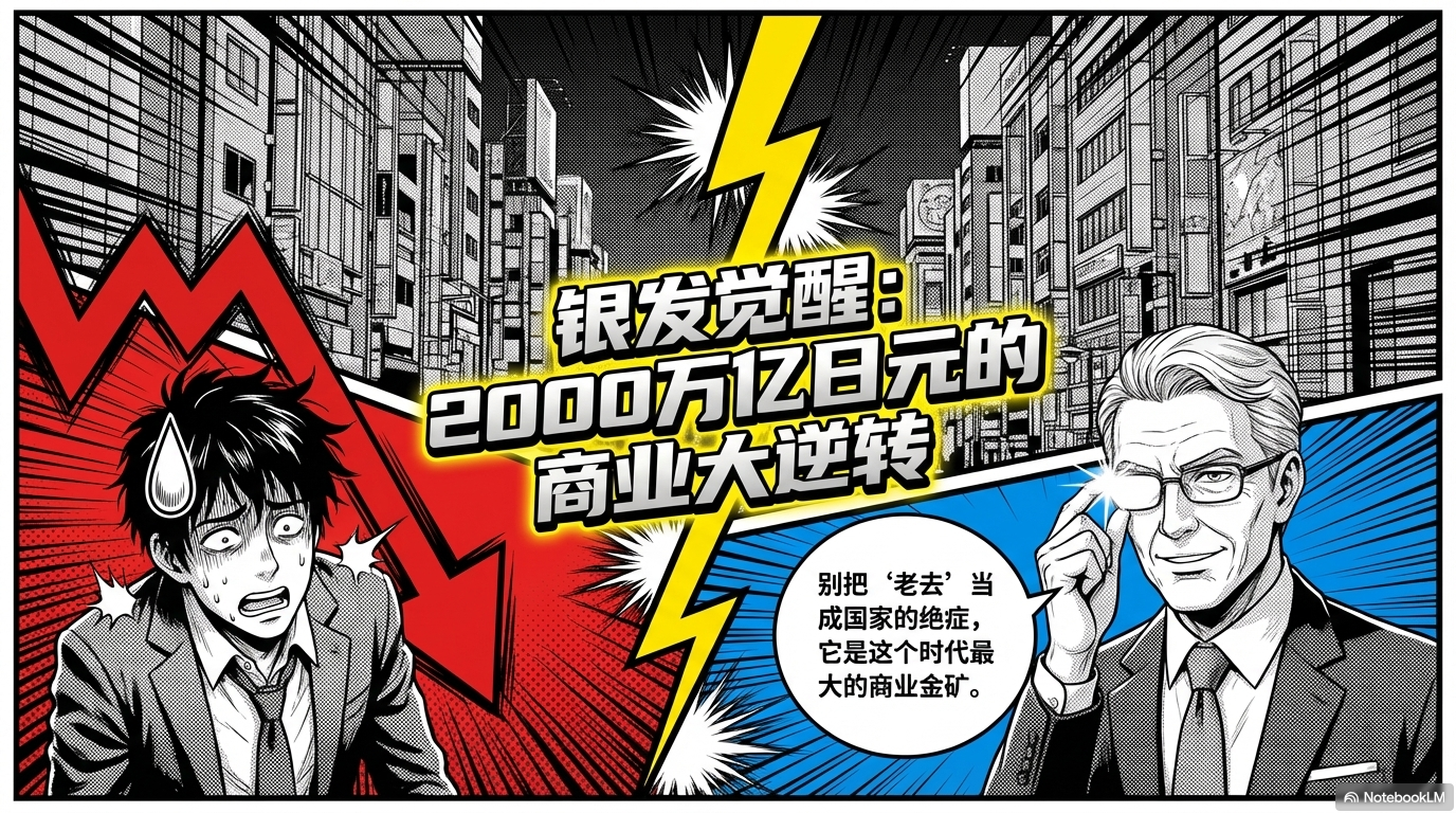
Manga Narrative

Visual Description: For user journeys, “don’t do this” guides, story scenarios — panels + bubbles + speed lines; slide deck as bingeable comic. Spec: White base, black type; modern Japanese-style multi-panel layouts; round/cloud speech bubbles, speed / burst lines, sweat / star emblems; red, blue, yellow as secondary accents; continuous story across slides; balanced text vs. art; high resolution.

Use template

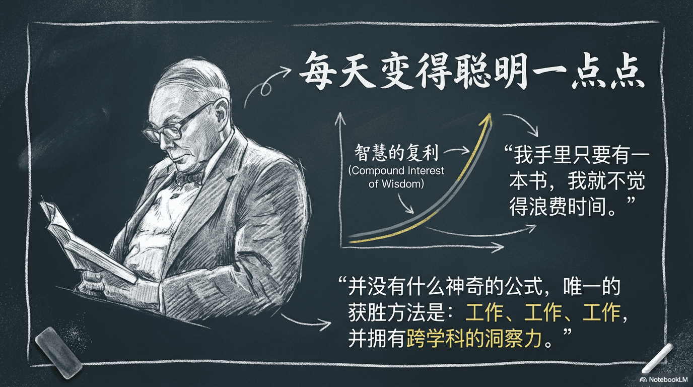
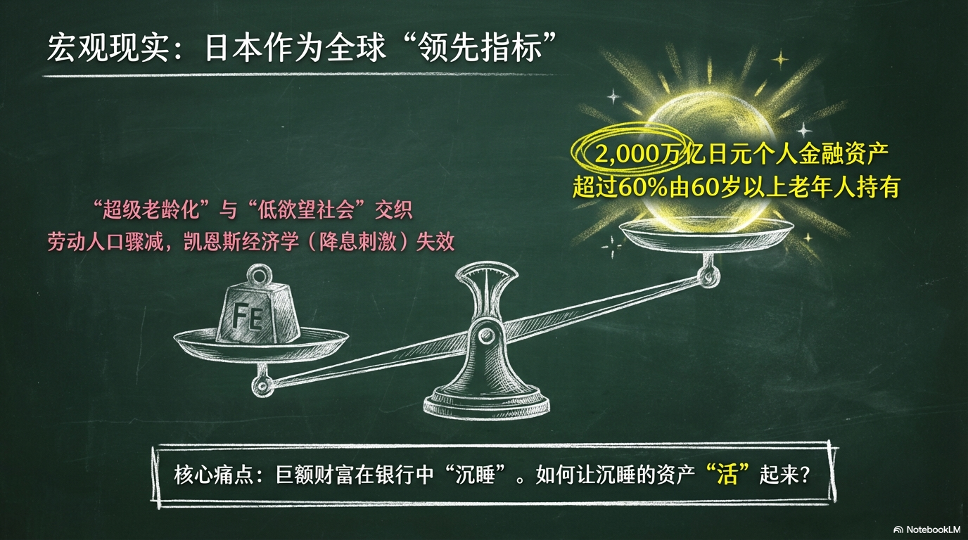
Chalkboard Education

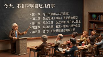
Visual Description: For training, explainer, “back to basics” reviews, retro school campaigns — deep green board + colored chalk + smudges; teacher at the blackboard warmth. Spec: Deep green board; text in white, yellow, pink hand-chalk styles; light erase smears, chalk-dust grain; doodle arrows, circles, stars, check marks; strong size hierarchy; optional board frame, eraser props; intro / body / summary flow; relaxed, educational, high-res, highly legible.

Use template

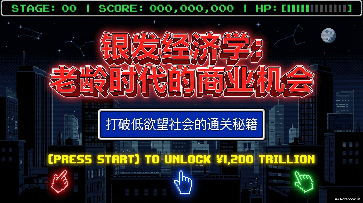
8-Bit Pixel Arcade

For status, sales goals, hackathon — turn tasks into level clears. Spec: 8-bit palette (red/blue/green), pixel grid; each slide a level panel; sprites, brick textures, coin/jump icons; pixel font; game frame + score bar; crisp, high-res, not blurry, playful retro.

Use template

Black × Blood Orange

For pitches, rebrands, portfolio — white field, black type, blood-orange accent; typography and whitespace carry the room. En prompt: White bg, black text, blood orange accent, creative-agency polish with simple dynamic photos and English type; body copy in the user’s language as given.

Use template

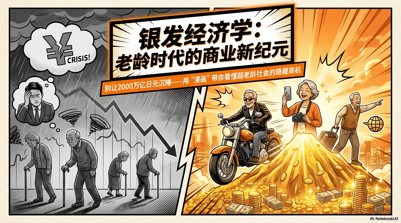
Manga · Edutainment

For concepts, tutorials, use cases, soft skills — make panels with story so the audience relates and remembers. Note: “Fun deepens understanding”; turn information into comics with narrative; tie to real situations; easier recall.

Use template

Living Artifact / Anti-Gravity

Domains: AI infra launches, high-end B2B product docs. Idea: not a “deck” but a living artifact — thought → structure; an interface for ideas. Emotion: “The system already runs; we are only showing you.” — calm, modern, confident, precise. Ref: Apple clarity, DeepMind research decks, calm infra launches. Canvas: Default pure white; blue → cyan → violet at very low opacity, edges/corners only, never behind text; feels like light, motion, anti-gravity — no hard shapes, no grids, no textures. Type: User’s language primary; English smaller/lighter as labels. Headline + one line + short bullets; no long copy. Color: Black / dark grey for text; one calm blue for emphasis (headline hits, arrows, key icons). Gradients are ornament, not structure. Layout: Left-aligned, wide margins, lots of air; common: type left + visual right, three feature cards, one idea per slide; reads like product docs visualized. Metaphors: (A) scribble → arrow → clean diagram — agents resolve ambiguity. (B) Real app/browser shots + cursor/click — “it really works.” (C) Soft rounded cards, micro-shadow, icon + title + 1–2 lines — capability without flair. Icons: Thin outline, one stroke weight — no pixel art, no emojis, no cute icons. Implied motion: arrows, sequence, flow — systems running. Copy: Clear, a little philosophical, no hype, buzzwords, or melodrama. Strict no: No pixel look, no fat borders, no loud color blocks, no collage/stickers, no loud contrast — if it feels “fun,” it’s wrong; if it feels inevitable, it’s right. Full deck = one product story.

Use template

Deformed Flat Persona

For mental-health apps, onboarding, light community rules, life tips — max approachability, low stress. Rules: Flat fill; slightly deformed figures; thick outlines; soft gray tones + white; max 3 colors total; thick lines; one solid background color.

Use template

One-Line / Drawing

For lifestyle, healing, niche fragrance, yoga, designer jewelry, florals — one continuous line system. Lines: Organic weight change; avoid ruler-straight; keep hand tremor. Palette: Base #F4F5F7 / #F0F2F0; stroke #2C3E50 / #4F5D54; accents sage #8DA399, dusty blue #9CADCE, lavender mist #E6E6FA. Type: Elegant Mincho/serif for titles, slim sans or script for Latin; body slender readable sans; ~2.0 line height. Tricks: One-line “hero” underline; one thread for timeline; leaf/bud bullets; line-built donut vs filled pie; arch/oval photo crops with offset sketch; vines from a keyword; interview portrait + thin connector; link three motifs with one line. Rules: No vivid color; avoid pure #000 — use navy/charcoal; implied continuity between elements; optional wash of sage or dusty blue under line art.

Use template

Knolling / Flat Lay

For tool comparisons, tidy tips, study/office gear, before/after. Tokens: Bg #F6D0D6, type #2D2D2D, accent #CBE4F0, more #FDF6DA, #FFF, #9EA4A9; overhead knolling, 50/50 split for problem vs solution; photoreal stationery, soft top light, real soft shadows, grid-aligned objects. Type: modern JP-style sans med titles, clean regular body, labels on objects/screens. Tags: Knolling, split-screen, pastel, flat lay, minimal.

Use template

Modern Retro Risograph

For sociology/psychology concepts, creative process, system models (e.g. design thinking). Tokens: #F4F1E8 bg, #2D2D2D type, #D94646 accent, #2C65A6, #F2C044 secondaries; overlapping primitives, multiply blends, Riso grain, flat light = transparency only, not fake shadows; diagonal flow, thin arrows, line + solid mix. Type: bold gothic headlines, medium sans body, left-anchored to shapes. Tags: Risograph, Bauhaus, infographic, education, flat.

Use template

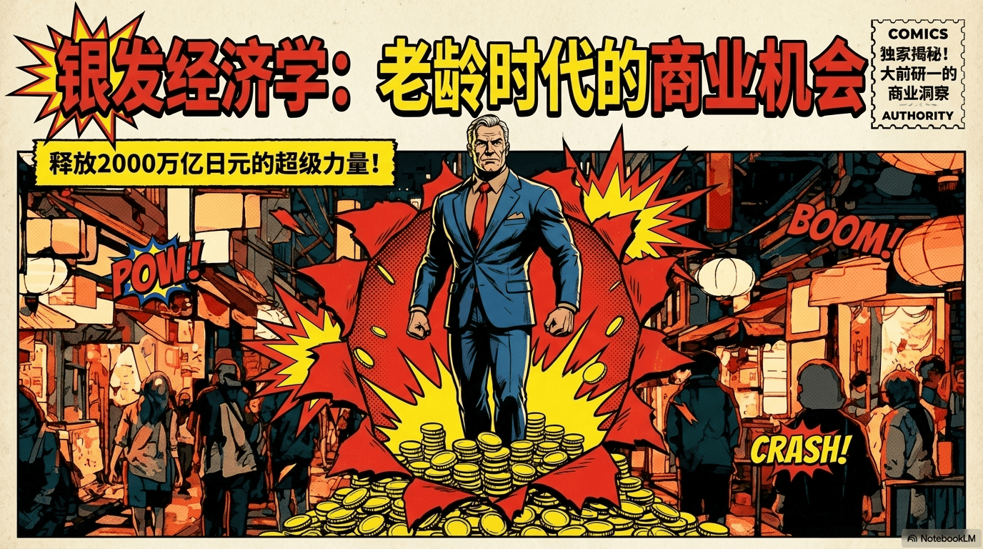
Vintage American Comic

For problem/solution, team hype, satirical work takes. Tokens: #F9F7E8 bg, #050505 ink, #FCEE21 pop, plus #E62E2D, #2A5CAA, #D4A578, #5C4535; multi-panel grid, bubbles, star bursts, heavy black contours, hero anatomy; newsprint grain, ink bleed, no gradients; dense grid, action breaks panels; flat lighting + ink chiaroscuro; onomatopoeia in jagged bursts. Type: block display + uppercase comic hand. Tags: Pop art, vintage comic, sequential, action.

Use template

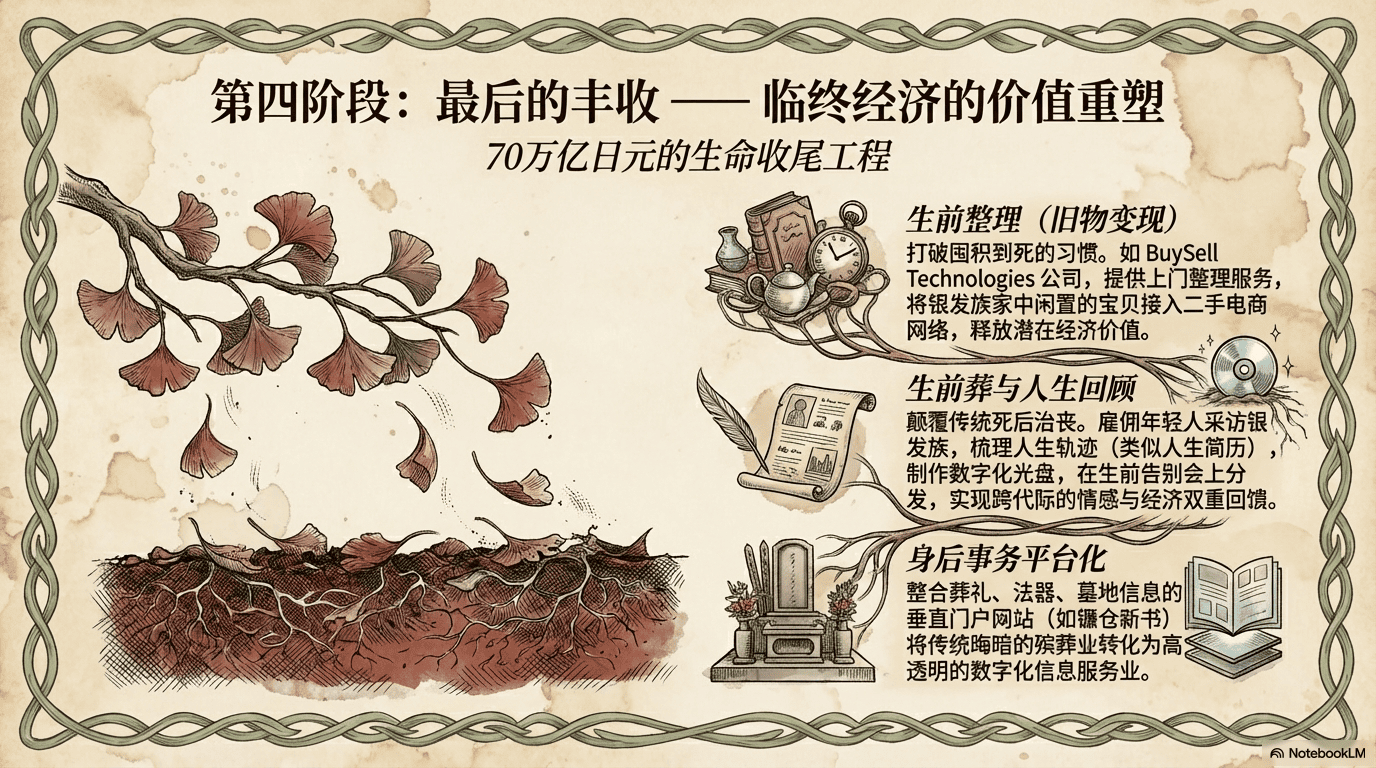
Vintage Botanical Scientific

For botany/TCM education, organic brands, “roots” and growth metaphors. Tokens: Parchment #F0E5D3, ink #1A1512, accent #BF6B63; greens/browns #6B7F5E, #8C735A, #CDB898, #A65E55; hand cross-sections, vine frames, callout labels; aged paper, stains, foxing, wash + quill hatching; central plant rooted, symmetrical leaf border, peripheral academic notes. Type: old-style serif (Caslon/Garamond feel), italic Latin labels. Tags: Vintage, botanical, scientific, academic, neo-Victorian.

Use template

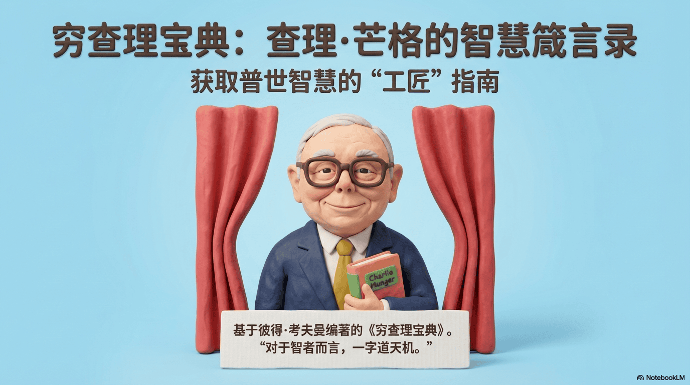
3D Claymation / Clayomorphism

For beginner how-to guides, children’s education, “lowering the fear” of complex flows (tax filing, waste-sorting diagrams, onboarding). Overall: Tone Clay, whimsical, approachable, educational, warm, engaging. Tokens: Bg #AEE2F6, type #4A3B32, accent #FF8A5B; secondaries #7EC466, #FFD93D, #E86F6F, #F4F1EA, #5DADE2; stop-motion plasticine, buttons, fabric, cardboard cutouts, speech bubbles + flowchart arrows; soft matte clay, fingerprints, rounded organic edges, physically modeled; sequential process map, center-weighted vignettes, stepped story rhythm; soft top-down GI, gentle ground shadows, low-contrast studio highlights; perspective orthographic / slight isometric. Type: rounded sans headings, bubble / hand-lettered weight. Materiality: modelling clay & plasticine. Tags: Claymation, 3D illustration, educational, playful, tactile.

Use template

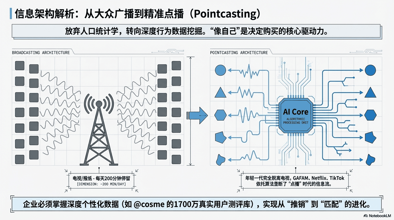
Modern Engineering Blueprint

For logic- and accuracy-first content: renovation floor plans, software architecture, teardowns, business SOPs. Overall: Tone Analytical, precise, pedagogical, structured, professional. Tokens: Bg #F9F9F9, type #222222, accent #5B9BD5; #C0392B, #EAF4FC, #888888, #FFFFFF, #D3D3D3; technical line art, dimension markers, architectural plan symbols, isometric diagrams, flow arrows; flat digital paper, clean vectors; split comparative layout, vertical hierarchy, grid-aligned diagrams, balanced whitespace; flat diagram lighting; line weight thin precise 1–2px structure, dashed for logic; aids blue fills for active elements, red dashed arrows for transitions/errors. Type: bold gothic/Helvetica-class sans headings, medium sans body, condensed sans or mono for specs. Tags: Schematic, architectural, process mapping, technical, educational.

Use template

Chalkboard Hand-Drawn Infographic

For knowledge summaries, exam outlines, “listen up” pitfall guides. Overall: Tone Educational, approachable, informative, nostalgic, structured. Tokens: Board #263238, chalk #F5F5F5, accent #F4D03F; #E74C3C, #5DADE2, #AF7AC5, #D35400; hand-drawn chalk illustrations, ribbon banners, doodle ornaments, schematic arrows, chalk-outlined panels; matte slate grain, chalk dust, variable-pressure strokes; centralized vertical flow, compartmentalized blocks; flat illustrative high contrast on dark. Type: bold handwritten marker headings, clean chalk print body, emphasis thick yellow/red + underlines. Tags: Chalkboard, hand-drawn, educational, infographic, sketch.

Use template

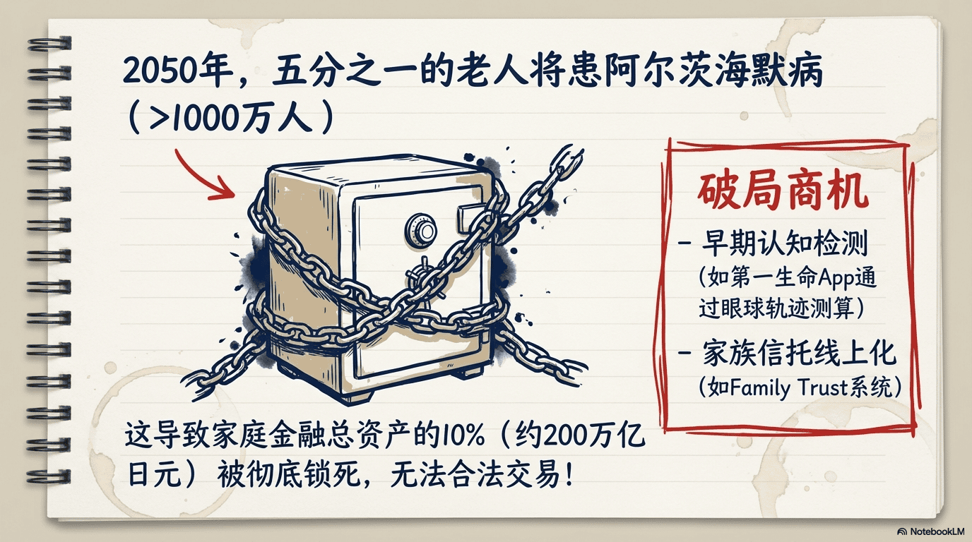
Spiral Notebook Sketch

For authentic thinking, brainstorm drafts, “just wrote this down” shareability. Overall: Tone Authentic, intellectual, informal, creative, instructional. Tokens: Paper #F4F1EA, ink #0E2A5C, accent #D12828; #C8AB83; hand diagrams, spiral binding, coffee rings, arrows, stick figures, bubbles, stars; ruled lines, grain, bleed, stains; top-down flowchart logic, loose organic grouping; gel pen variable weight. Type: handwritten marker-bold titles, casual print/cursive hybrid body, red underlines and boxing. Tags: Hand-drawn, brainstorming, educational, analogue, sketch-note.

Use template

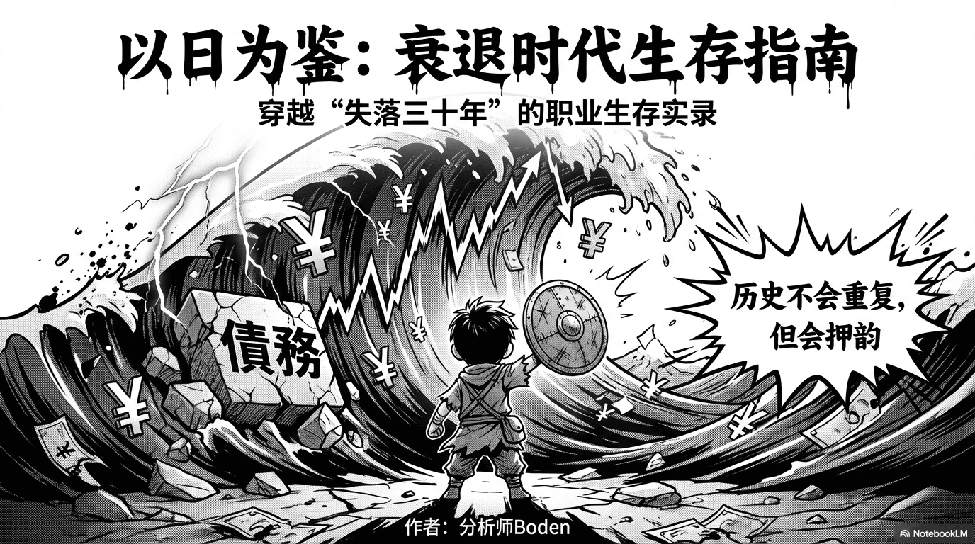
Japanese Instructional Manga (B&W)

For beginner how-tos as heroic quests and pitfall drama with exaggerated acting. Overall: Tone Energetic, expressive, narrative-driven, highly instructional, dramatic flair. Tokens: #FFFFFF field, #000000 ink, #1A1A1A accent; grays #4D4D4D, #808080, #B3B3B3, #E6E6E6, #F2F2F2; dynamic paneling, chibi/shonen acting, speed lines, impact bursts, embedded process diagrams; halftone screentone, crisp line weights; asymmetric panels, diagonal cuts, chaos → clarity progression; G-pen line work; metaphors lightbulbs, gears, sweat, jagged bubbles, mood BG patterns. Type: heavy brush / distorted SFX headings, rounded legible sans in bubbles, hand-lettered katakana-style SFX. Tags: Manga, instructional comic, high-contrast, storytelling, sketch note.

Use template

Yume-Kawaii / Candy Dream

For journal spreads, dessert tutorials, fandom, soft healing content. Overall: Tone Playful, whimsical, encouraging, soft, highly decorative. Tokens: Bg #FFD1DC, type #222222, accent #9D84B6; #C3E5F9, #FFFACD, #E0BBE4, #FF9AA2, #B5EAD7; rainbow gradients, fluffy clouds, sparkles, unicorn/bear mascots, candy icons; airbrush gradients, glossy highlights, smooth vectors; central hierarchy into rounded pillars, decorative borders; high-key light, soft shadows; thick pastel outlines, short wide 3D arrows; floating hearts, stars, candies. Type: rounded pop gothic / balloon sans headings — white fill, thick stroke + shadow; rounded sans body, often in light bubbles on busy BG. Tags: Kawaii, pastel, yume-kawaii, educational, pop art.

Use template

Neumorphic Tech / Corporate

For business logic, product ecosystems, hub-and-spoke diagrams that feel official and trustworthy. Overall: Tone Professional, informative, structured, sleek, security-aware clarity. Tokens: Bg #F4F6F8, type #2C2C2C, accent #EB5757; central hub-and-spoke, gradient flow lines, soft circular icon pods, clean line icons; smooth matte surface, gentle neumorphic lift shadows; bilateral symmetry, central focal point, curved branching connectors; tapered connectors with cool vs warm gradient sides; thin line icons in elevated white circles. Type: condensed bold uppercase sans (Roboto Condensed / Oswald class), clean geometric sans body, hierarchy Bold Caps > Bold feature titles > regular descriptions, center title, side blocks toward axis. Tags: Corporate tech, neumorphism, data visualization, clean minimalist, symmetrical.

Use template

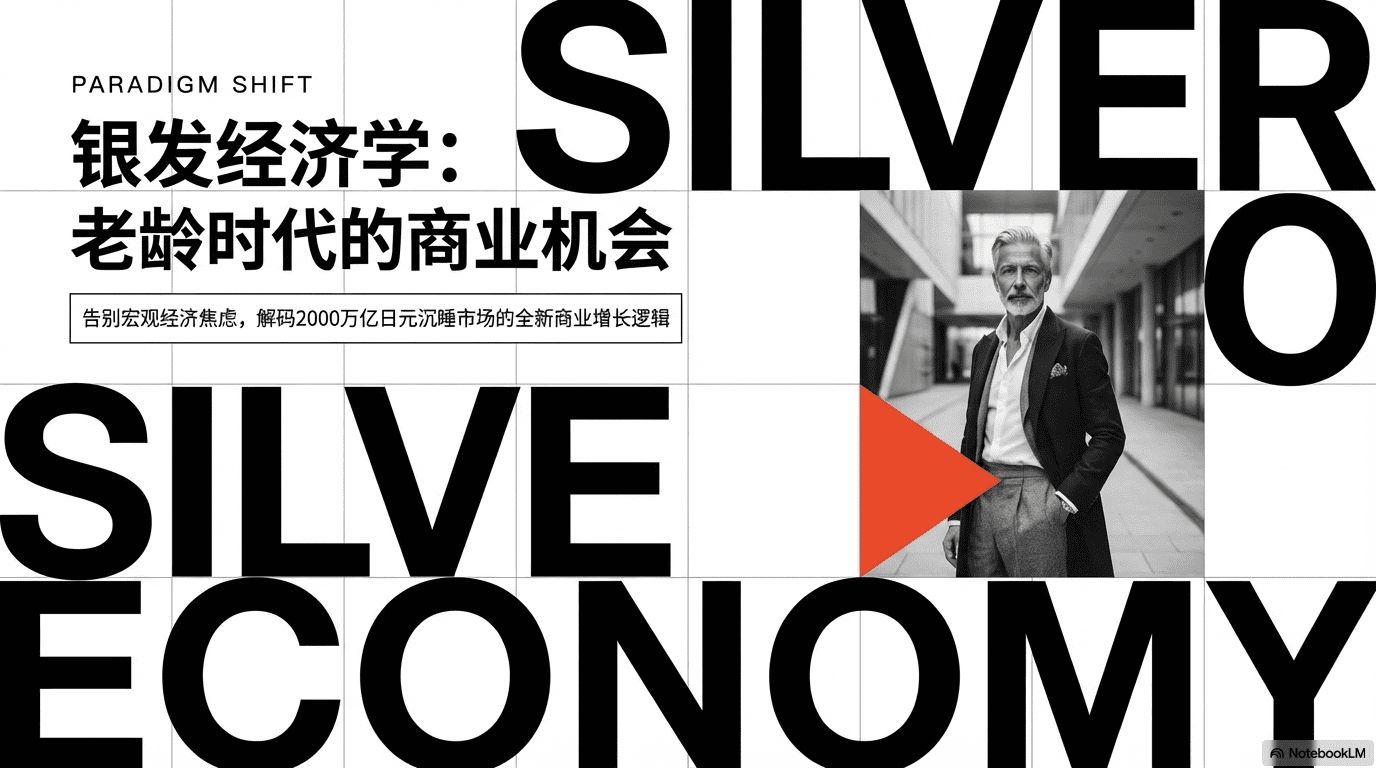
Swiss Retro Collage

For biography, history, cultural essays — vintage photos × bold geometry. Overall tone: Intellectual, cultured, structured, vibrant. Tokens: Bg #F9F9F7, type #1A1A1A, accent #FDD835; grayscale vintage photo cutouts + flat geometric color blocks; bold geometric sans uppercase. Prompt discipline: Neo-Constructivist Collage Archive-style infographic — maintain structure and palette DNA. Tags: Collage, Swiss style, educational, mixed media, retro-modern.

Use template

Neo-Traditional Ink × Tech

For culturally grounded narratives — Eastern philosophy framing business/tech or heritage digitization. Overall: Tone Sophisticated, timeless, authoritative, culturally fused. Tokens: Paper #F4F1E8, ink #0D0D0D, seal red #8A1C15; sumi-e washes × crisp isometric technical diagrams / clean 3D renders; rice-paper grain, fiber, bleed, splatter, dry brush; bilateral symmetry split by central vertical axis, two-column icon + text; flat ambient paper light; red sparingly for chops/dividers. Type: classical serif (Garamond/Caslon bold) headings, readable serif body, bold/medium/regular hierarchy, underlined headers with subtle flourish. Tags: Ink wash, neo-traditional, East Asian fusion, parchment, artistic technical.

Use template

Classic Corporate Infographic

For step-by-step SOPs: project timelines, service flows, lifecycle funnels. Overall: Tone Professional, structured, instructional, clear, organizational. Tokens: Bg #FFFFFF, type #333333, accent #008B8B; #8E44AD, #2E4053, #27AE60, #F1C40F, #C0392B; semicircular timeline, segmented process arc, flat vector icons, numbered milestones, directional arrows; flat smooth vector, matte, no gradients or drop shadows; radial symmetry, centered arch, radiating text clusters; white glyphs in colored segments; thin colored connectors; optional human silhouette care anchor. Type: modern sans bold headings (Lato/Roboto class), regular sans body, colored sans subheads per segment, white sans numerals in circular badges. Tags: Corporate, infographic, process flow, clean design, radial layout.

Use template

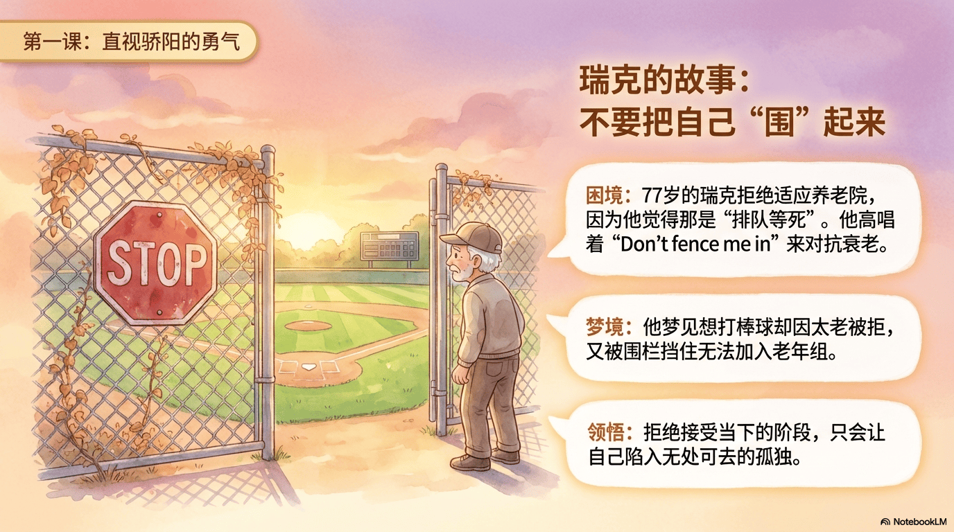
Japanese Studygram / Kawaii Journal

For study logs, pretty vocab books, travel diaries, mood notes — make routines cute and healing. Overall: Tone Playful, personal, educational, approachable. Tokens: Bg #F4F2E9, type #2B2B2B, accent #6FA3D2; #FF9EC6, #F2E66B, #8D6E54, #A8A8A8; hand-drawn doodles, notebook grids, mascot characters; matte paper grain, felt-tip ink, translucent highlighter; organic compartmentalized layouts mixing text + vignettes; flat scan-like light; consistent monoline rounded ink; simple expressive face characters; decor hearts, stars, sparkles, arrows. Type: hand-lettered bubble titles with diagonal hatch fill + outlines, neat hand-print body (JP/CN sans feel), pastel pink/yellow highlight blocks. Tags: Hand-drawn, educational, Studygram, kawaii, journaling.

Use template

Clay Stop-Motion Storyboard (Narrative Deck)

For structured decks where every slide ships a clay scene brief — reads as true stop-motion plasticine, not flat illustration. Rules: Entire visual world = clay-built sets; figures/props/backgrounds sculpted with handmade tactility and slight imperfections; moderate saturation, warm and playful, not photoreal 3D. Per-slide image brief must specify: location (classroom, street, office, cosmos…), clay character action + expression, key symbolic props (books, charts, signs, gears…), and mood (warm / tense / funny / motivational). Lock style language: clay stop-motion animation, frame-by-frame feel, not generic cartoon. Pair each slide with title, bullets, and first-person speaker notes.

Use template

Dan Koe-Style B&W Ink / Engraving

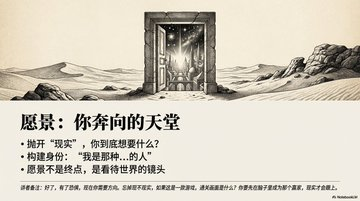
For lonely, exploratory, “void and scale” keynote art paired with ultra-sparse slides. Mood: Monochrome high contrast; pen-and-ink / vintage etching; dense cross-hatching (3–5 layers) + stippling; scratchboard + paper grain; dramatic chiaroscuro; pure black negative-space void (hole / door / abyss) as anchor; tiny human or astronaut vs gigantic unknown. Layout tip: 16:9, ultra-wide banner hero on top, minimal type below; titles as verdict-short lines. Image negatives (append to every visual prompt): no color, no photo realism, soft airbrush, blur, low detail, flat lighting, cartoon/anime, no on-image text/logo/watermark/UI.

Use template

Retro American Pop / 1950s Poster

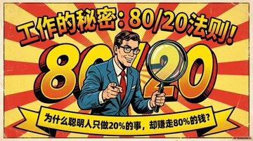
For beginner-friendly talks that should feel like mid-century ads + comics. Look: Heavy black outlines, big flat color fields, halftone print texture, aged cream paper; palette red, green, yellow, beige, loud contrast; multi-panel or column infographic — top hero headline + icons (megaphone, gift, button, arrows), bottom short copy; reads as retro marketing poster / Pop Art infographic, not vanilla corporate.

Use template

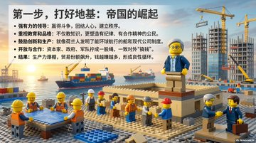
LEGO Brick / Minifigure World

Explain ideas as if everything is built from bricks — great for metaphors (“snap modules together”). World rules: Cast = LEGO minifigures (call out outfit colors, expressions); environments = brick-built city, campus, HQ, space station; props as LEGO computers, coins, books, gears, brick charts. Hard lock: style tags LEGO style / Lego bricks / Lego minifigures; no realistic humans. Each slide: title, bullets, first-person notes, plus a text-only scene brief for image gen; emphasize brick materiality and playful staging.

Use template

Miniature Diorama / Tilt-Shift Macro

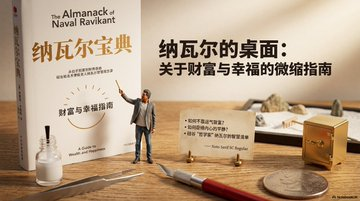
Everything happens in a scaled model world on a desk — not flat cartoon, not LEGO, not real-people photos. Craft: Figures as scale miniatures (1:24–1:87 feel); materials foam, wood, resin, cardstock, paint chips, glue seams, weathering; macro lens, shallow DOF, soft studio light, real shadows, tilt-shift mini look. Scene briefs must name diorama type (mini office, factory, lab…), figure pose/outfit, symbolic props built as models, material honesty, and photo parameters; include the mandatory style line verbatim: miniature diorama, tilt-shift, macro photography, shallow depth of field, handcrafted scale model, realistic lighting, not cartoon, not lego (+ Chinese counterpart).
Use template

Chinese Y2K Dreamcore

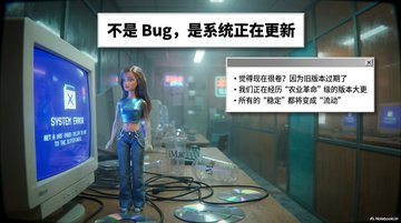
Nostalgic uncanny — liminal CN Y2K spaces: metro corridors, footbridges, mall arcades, internet cafés, KTV halls, lustrous lobbies. Architecture: blue/green/tea glass curtain walls, metal rails, glossy tile, neon strips, acrylic signs; chrome, gradients, translucent plastic; era gadgets flip phones, MP3, CCD, CRT, game pads. Figures: plastic / vinyl toy dolls only — Y2K outfit checklist (low-rise denim, baby tee, slim shades, choker, butterfly clips…). Camera: early-2000s CCD digicam — hard flash, slight softness, punchy color, noise, low-res nostalgia. Legible type (mandatory): put copy on clean white panels — top title bar + right info card, parallel to lens, high-contrast sans; background may blur, panels stay sharp; keep titles and bullets short so type stays crisp. Closing style string (verbatim, EN + CN): Chinese Y2K dreamcore… crisp legible Chinese text on clean white panels… not cartoon, not lego, not real human.
Use template